
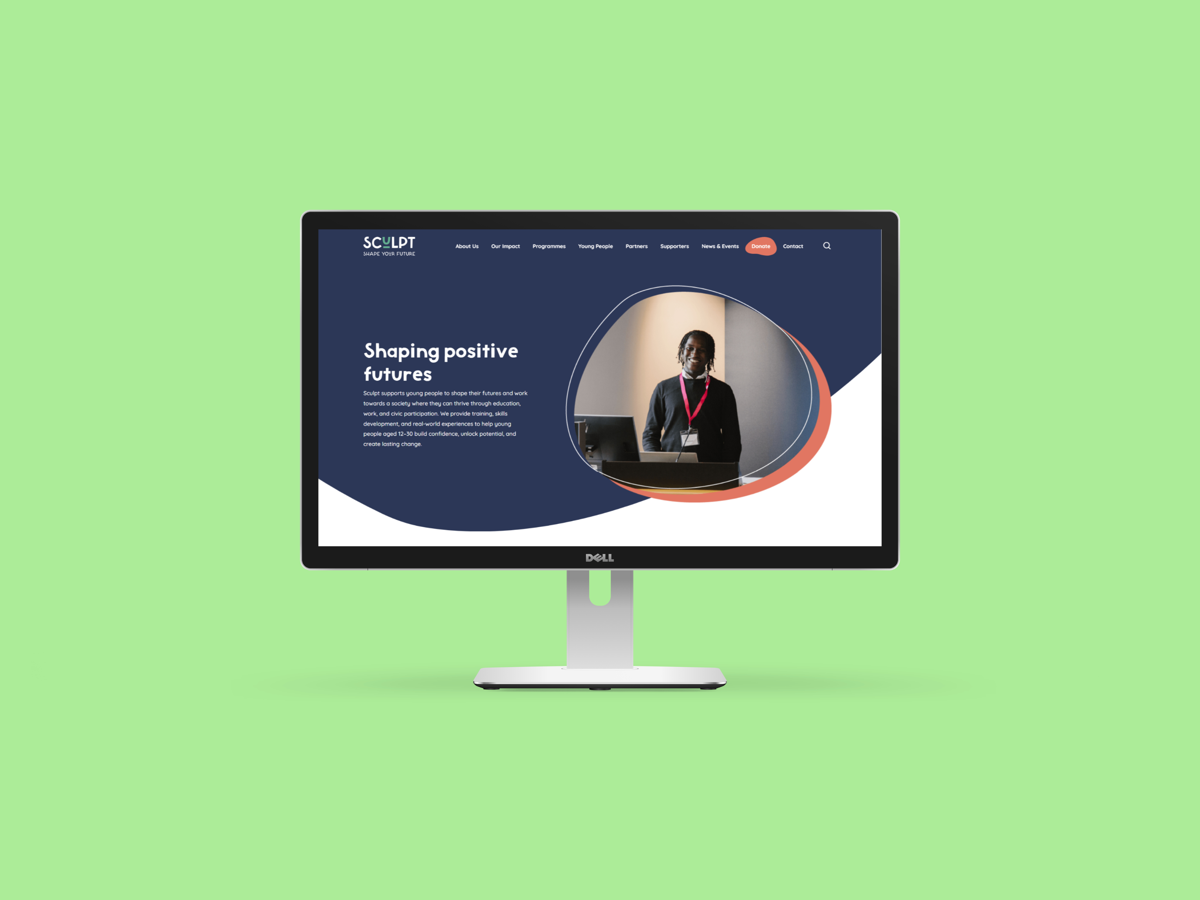
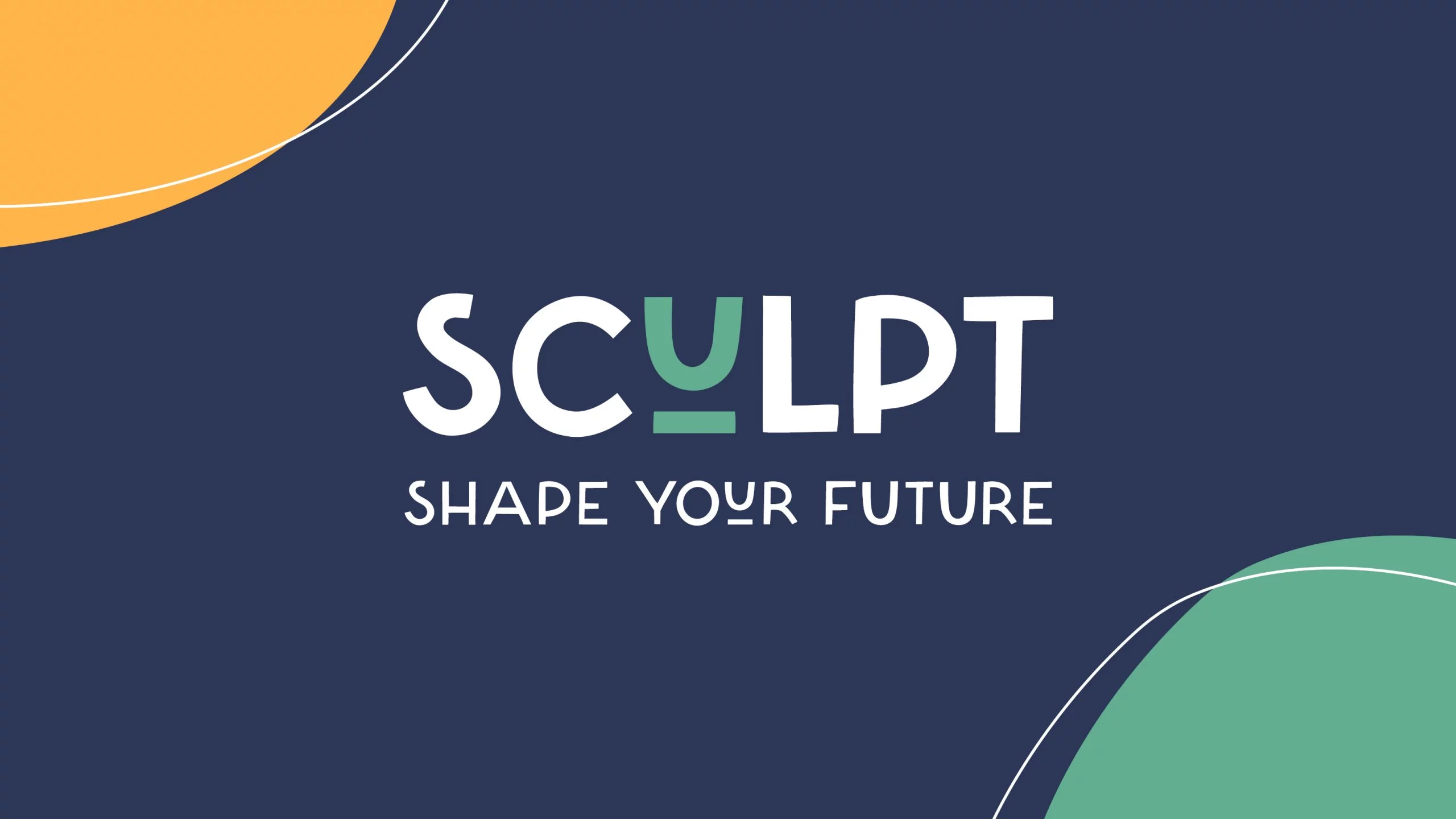
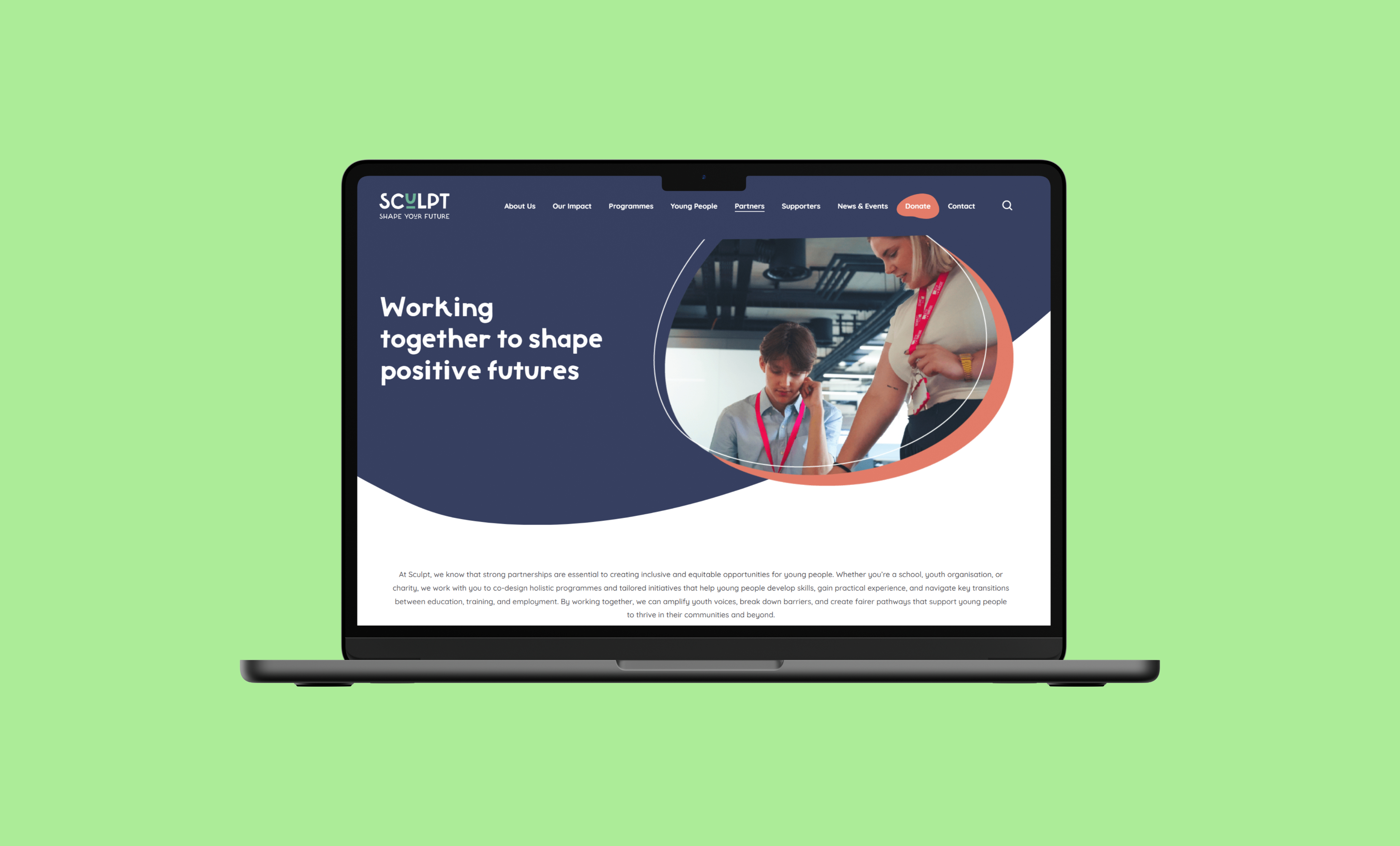
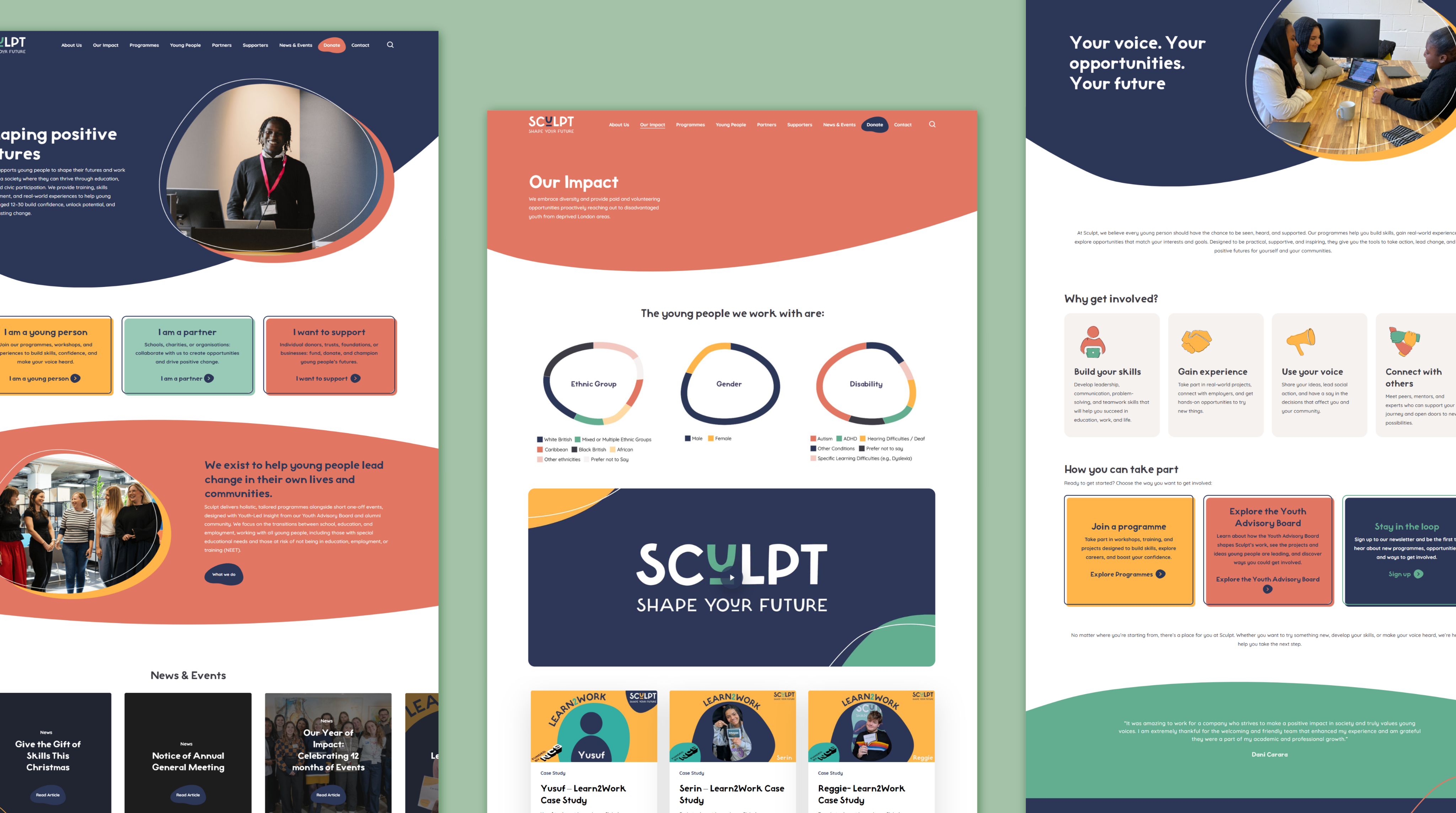
Transforming Sculpt’s digital presence for clarity and impact
Working closely with key stakeholders, we restructured the site, refreshed the UI, and built a flexible system that clearly communicates Sculpt’s mission and better supports the young people they serve.
UX Design
UI Design
Accessability
User Resarch
User Resarch
User Resarch
Figma
Adobe Suite

What’s the story?
While working as a UX Designer at Oxygen, I helped lead the redesign of Sculpt’s digital presence during their organisation-wide rebrand. Alongside another designer, I reworked the site structure, refreshed the UI, and created a clearer, more youth-centered experience aligned with Sculpt’s renewed mission.
My role
UX/UI & Brand Designer (at Oxygen)I worked within Oxygen’s small design team, contributing to the new brand identity and translating it into a clear, youth-focused website experience.
How I contributed
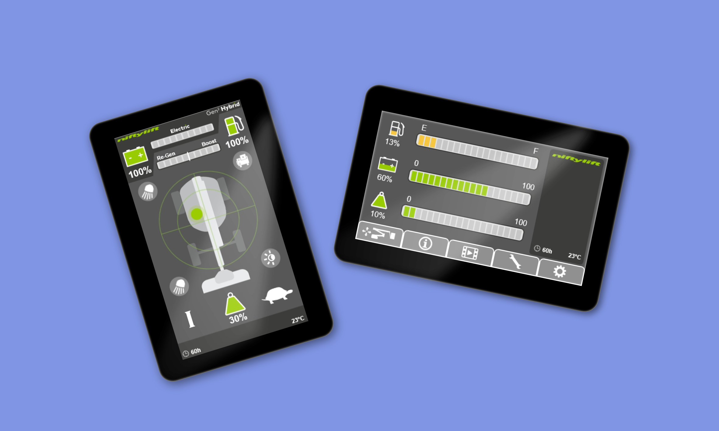
- A full UI system for the operator display, including navigation, fault logic, and task workflows.
- Interactive prototypes used for engineering alignment and field testing.
- Streamlined navigation, clearer fault signalling, and improved task flows.
What I delivered
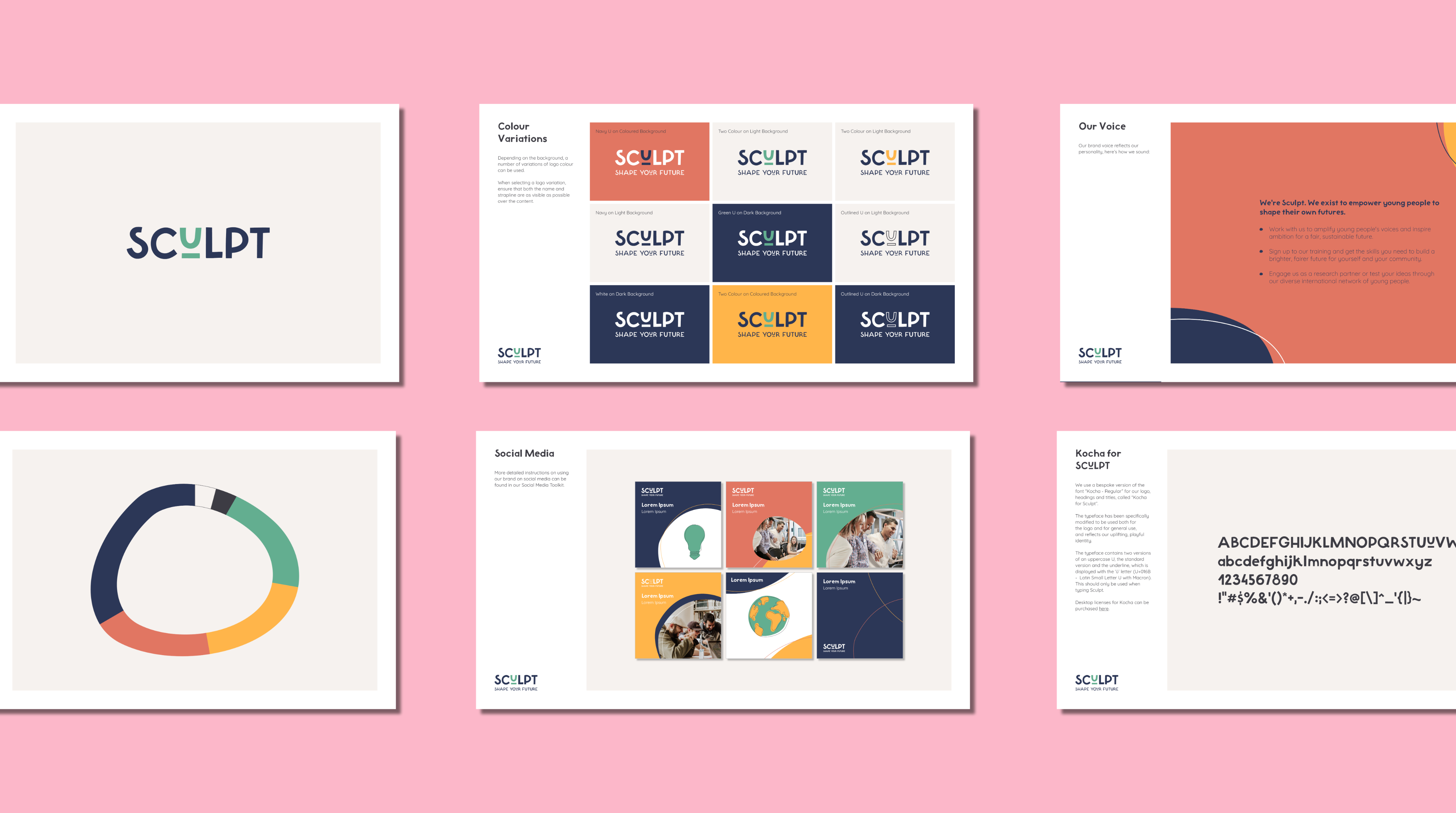
- A complete digital expression of Sculpt’s new brand and positioning
- Website designs applying the new logo, custom typography, and colour system
- A scalable UI system to support future content and growth
- Clear, accessible layouts tailored to young audiences

Why it matters
The redesign needed to do more than serve young people, it also had to clearly communicate Sculpt’s value to partners, funders, and stakeholders. By simplifying the structure, sharpening the messaging, and presenting the organisation’s work more confidently, the site now supports both audiences: helping young people find support, while giving partners a clear reason to invest, collaborate, and get involved.
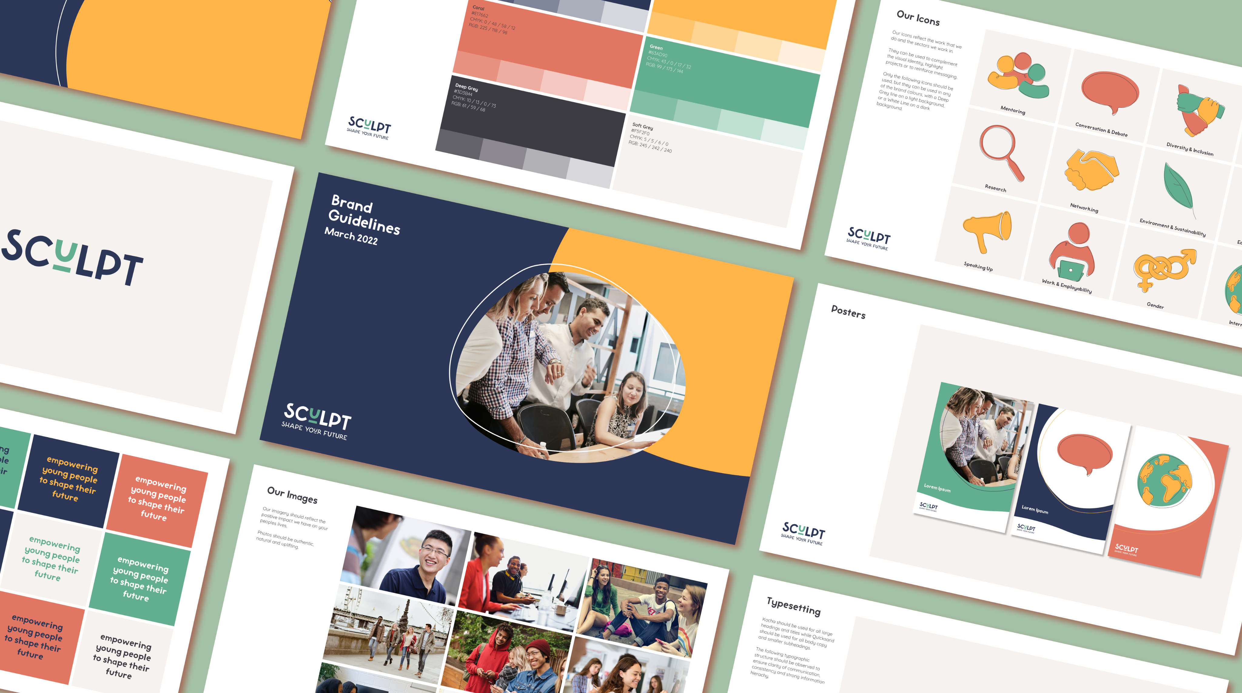
A brand that finally matches their mission
Our work helped shift Sculpt’s identity from academic and inaccessible to warm, youth-centred, and empowering, making their purpose immediately clear to young people, partners and funders.
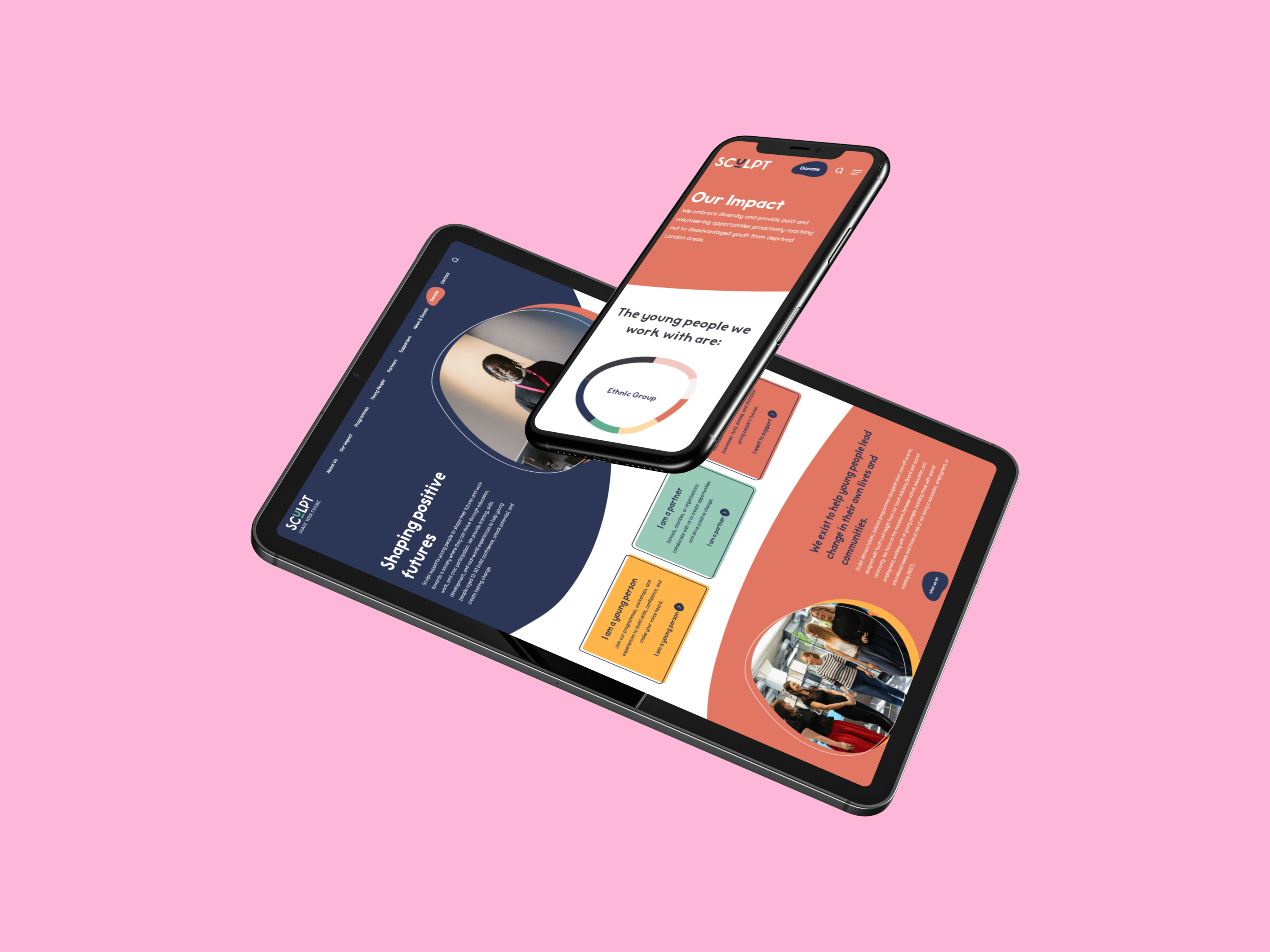
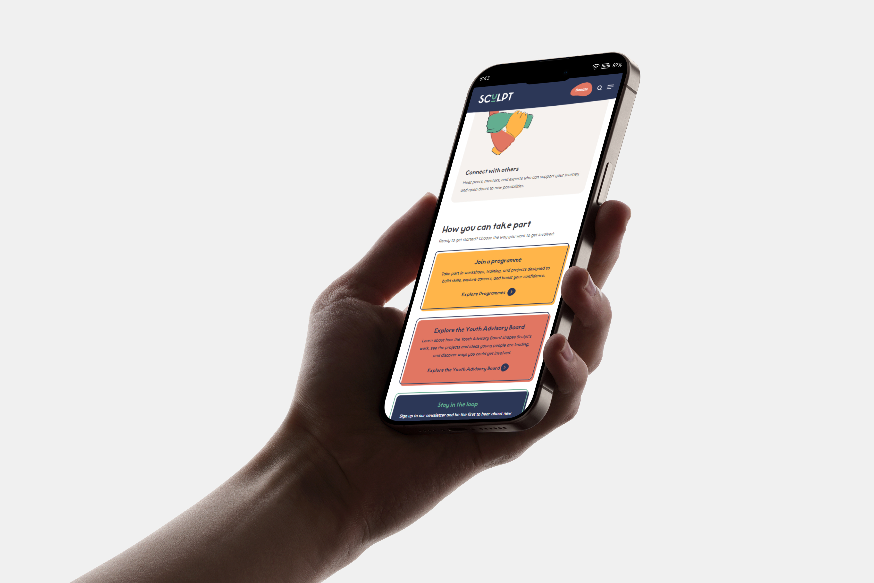
A website that’s easier for everyone to use
By simplifying navigation, restructuring content, and removing friction points, we made it faster for young people, parents and professionals to find relevant support and opportunities.
A digital presence that can grow with them
The redesign created a flexible visual and structural foundation that Sculpt can build on; from campaigns to reports to new youth-focused programmes.
Measuring the impact
95%
Homepage Lighthouse Performance Score
56%
Cleaner than average websites
92%
SEO performance

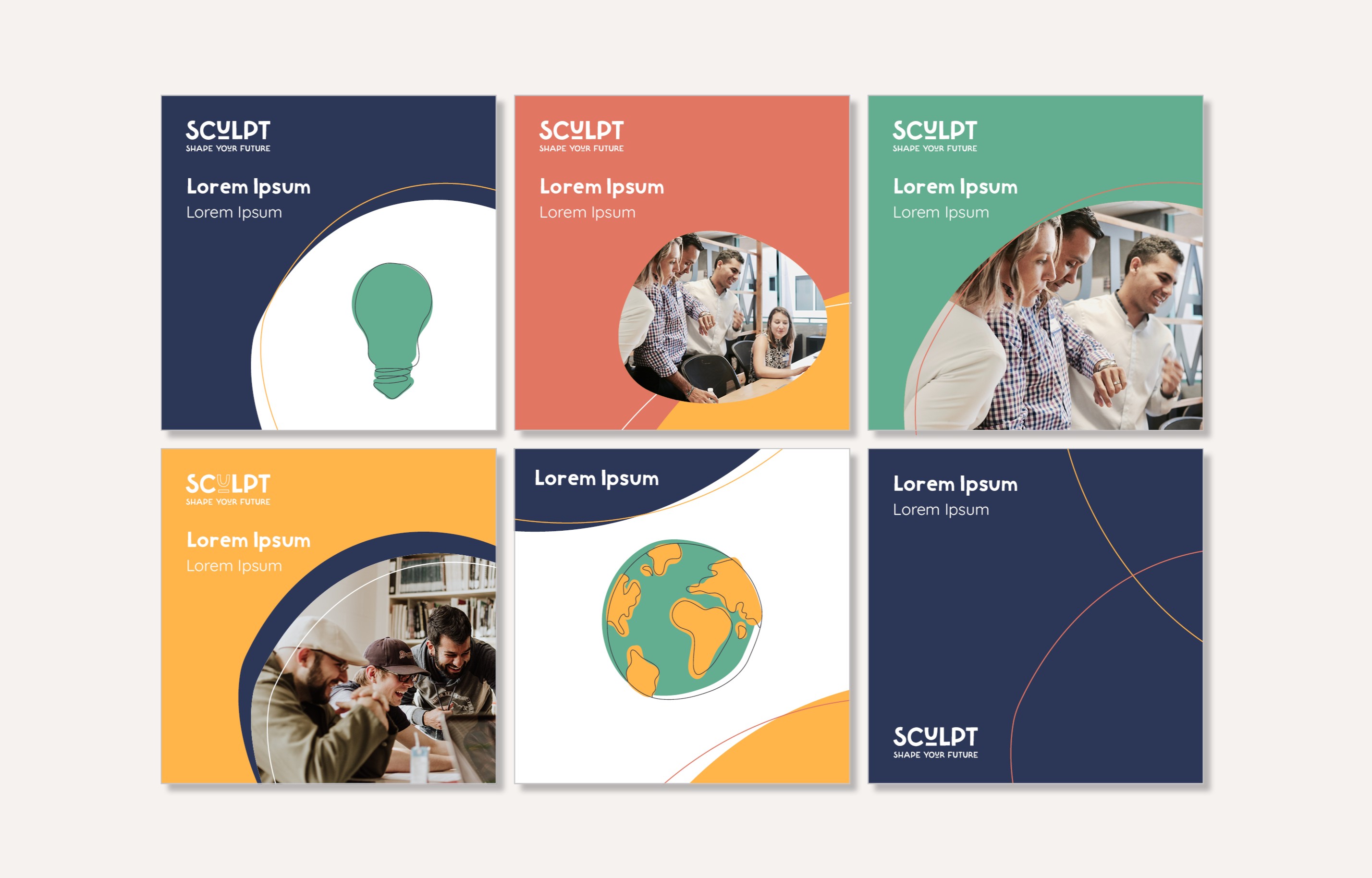
Bringing it all to life
A showcase of the brand and website redesign in action.
Dr Claire Bonham
CEO - Sculpt
Oxygen were extremely responsive to our questions and ideas and we are delighted with the end result. We would recommend working with Oxygen to anyone looking to update their visual identity and brand.
Dr Claire Bonham
CEO - Sculpt
Working with Oxygen was an extremely enjoyable and productive experience. The team took the time to understand our needs and utilised a wide range of skills to get us the result we needed - from organisational development and tone of voice to great design and technical ability.

More work worth exploring
From digital products to brand experiences, a curated selection of my work.
UX/UI
Accessibility
Prototyping
Designing for smarter hiring decisions
Making complex talent insights simple and human.

UX/UI
Branding
Visual Identity
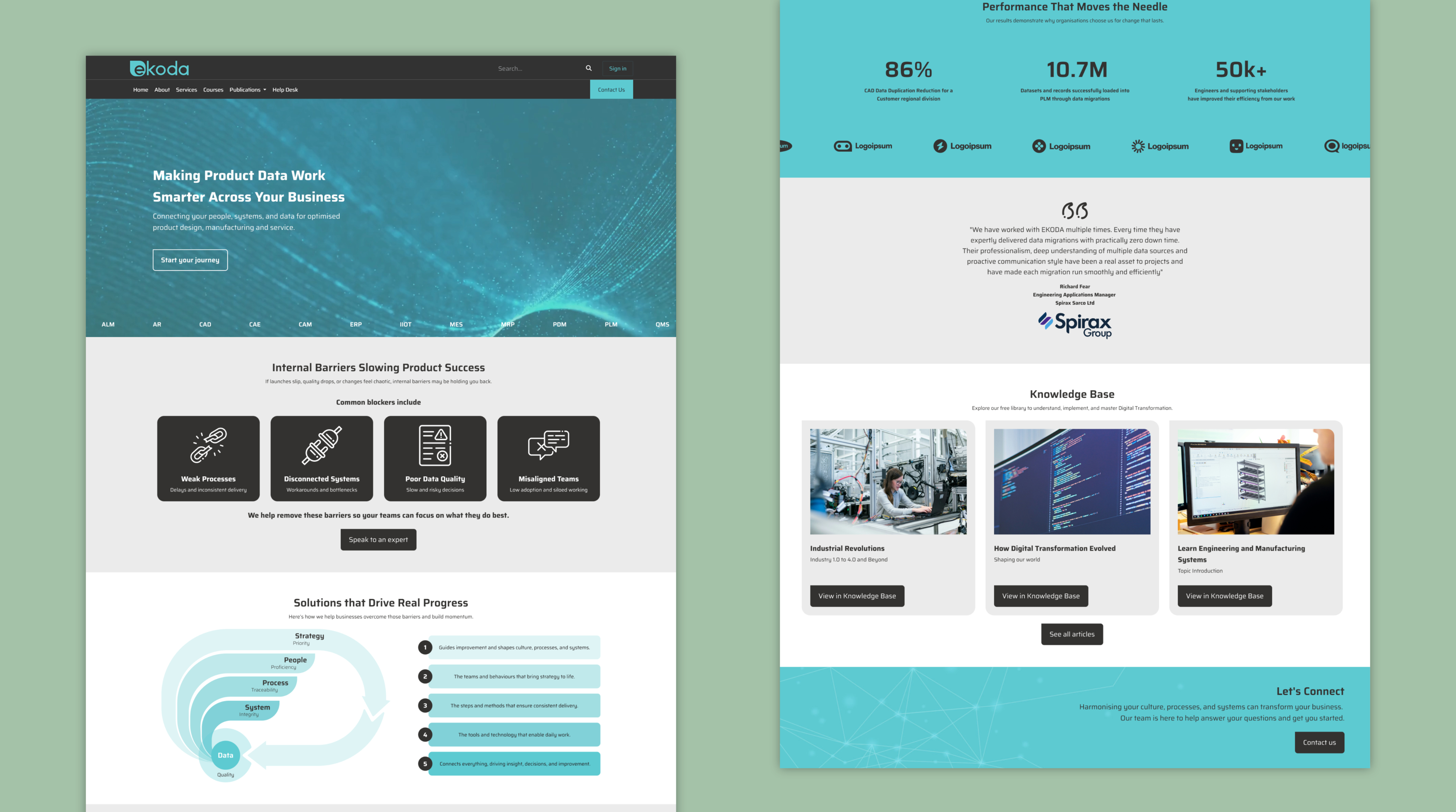
Rebranding a digital consultancy
Creating a cohesive identity and website to support growth
UX/UI
User Research
Prototyping
Redefining the operator experience
Designing intuitive machine interfaces to improve safety and efficiency.
See all projects


Transforming Sculpt’s digital presence for clarity and impact
Working closely with key stakeholders, we restructured the site, refreshed the UI, and built a flexible system that clearly communicates Sculpt’s mission and better supports the young people they serve.
UX Design
UI Design
Accessability
User Resarch
User Resarch
User Resarch
Figma
Adobe Suite
What’s the story?
While working as a UX Designer at Oxygen, I helped lead the redesign of Sculpt’s digital presence during their organisation-wide rebrand. Alongside another designer, I reworked the site structure, refreshed the UI, and created a clearer, more youth-centered experience aligned with Sculpt’s renewed mission.
My role
UX/UI & Brand Designer (at Oxygen)I worked within Oxygen’s small design team, contributing to the new brand identity and translating it into a clear, youth-focused website experience.
How I contributed
- A full UI system for the operator display, including navigation, fault logic, and task workflows.
- Interactive prototypes used for engineering alignment and field testing.
- Streamlined navigation, clearer fault signalling, and improved task flows.
What I delivered
- A complete digital expression of Sculpt’s new brand and positioning
- Website designs applying the new logo, custom typography, and colour system
- A scalable UI system to support future content and growth
- Clear, accessible layouts tailored to young audiences
Why it matters
The redesign needed to do more than serve young people, it also had to clearly communicate Sculpt’s value to partners, funders, and stakeholders. By simplifying the structure, sharpening the messaging, and presenting the organisation’s work more confidently, the site now supports both audiences: helping young people find support, while giving partners a clear reason to invest, collaborate, and get involved.
A brand that finally matches their mission
Our work helped shift Sculpt’s identity from academic and inaccessible to warm, youth-centred, and empowering, making their purpose immediately clear to young people, partners and funders.
A website that’s easier for everyone to use
By simplifying navigation, restructuring content, and removing friction points, we made it faster for young people, parents and professionals to find relevant support and opportunities.
A digital presence that can grow with them
The redesign created a flexible visual and structural foundation that Sculpt can build on; from campaigns to reports to new youth-focused programmes.
Measuring the impact
95%
Homepage Lighthouse Performance Score
56%
Cleaner than average websites
92%
SEO performance
Bringing it all to life
A showcase of the brand and website redesign in action.
Dr Claire Bonham
CEO - Sculpt
Oxygen were extremely responsive to our questions and ideas and we are delighted with the end result. We would recommend working with Oxygen to anyone looking to update their visual identity and brand.
Dr Claire Bonham
CEO - Sculpt
Working with Oxygen was an extremely enjoyable and productive experience. The team took the time to understand our needs and utilised a wide range of skills to get us the result we needed - from organisational development and tone of voice to great design and technical ability.
More work worth exploring
From digital products to brand experiences, a curated selection of my work.
UX/UI
Accessibility
Prototyping
Designing for smarter hiring decisions
Making complex talent insights simple and human.
UX/UI
Branding
Visual Identity
Rebranding a digital consultancy
Creating a cohesive identity and website to support growth
UX/UI
User Research
Prototyping
Redefining the operator experience
Designing intuitive machine interfaces to improve safety and efficiency.
See all projects

Transforming Sculpt’s digital presence for clarity and impact
Working closely with key stakeholders, we restructured the site, refreshed the UI, and built a flexible system that clearly communicates Sculpt’s mission and better supports the young people they serve.
UX Design
UI Design
UX Research
Visual Identity
Brand Identity
Web Design
Figma
Adobe Suite
What’s the story?
While working as a UX Designer at Oxygen, I helped lead the redesign of Sculpt’s digital presence during their organisation-wide rebrand. Alongside another designer, I reworked the site structure, refreshed the UI, and created a clearer, more youth-centered experience aligned with Sculpt’s renewed mission.
My role
UX/UI & Brand Designer (at Oxygen)I worked within Oxygen’s small design team, contributing to the new brand identity and translating it into a clear, youth-focused website experience.
How I contributed
- Co-led the end-to-end redesign of Sculpt’s website during the rebrand
- Simplified complex content into a clearer, more youth-centred structure
- Modernised the UI while ensuring accessibility and consistency across pages
- Worked directly with stakeholders to iterate, refine, and validate design decisions
What I delivered
- A complete digital expression of Sculpt’s new brand and positioning
- Website designs applying the new logo, custom typography, and colour system
- A scalable UI system to support future content and growth
- Clear, accessible layouts tailored to young audiences
Why it matters
The redesign needed to do more than serve young people, it also had to clearly communicate Sculpt’s value to partners, funders, and stakeholders. By simplifying the structure, sharpening the messaging, and presenting the organisation’s work more confidently, the site now supports both audiences: helping young people find support, while giving partners a clear reason to invest, collaborate, and get involved.
A brand that finally matches their mission
Our work helped shift Sculpt’s identity from academic and inaccessible to warm, youth-centred, and empowering, making their purpose immediately clear to young people, partners and funders.
A website that’s easier for everyone to use
By simplifying navigation, restructuring content, and removing friction points, we made it faster for young people, parents and professionals to find relevant support and opportunities.
A digital presence that can grow with them
The redesign created a flexible visual and structural foundation that Sculpt can build on; from campaigns to reports to new youth-focused programmes.
Measuring the impact
95%
Homepage Lighthouse Performance Score
56%
Cleaner than average websites
92%
SEO performance
Bringing it all to life
A showcase of the brand and website redesign in action.
Dr Claire Bonham
CEO - Sculpt
Oxygen were extremely responsive to our questions and ideas and we are delighted with the end result. We would recommend working with Oxygen to anyone looking to update their visual identity and brand.
Dr Claire Bonham
CEO - Sculpt
Working with Oxygen was an extremely enjoyable and productive experience. The team took the time to understand our needs and utilised a wide range of skills to get us the result we needed - from organisational development and tone of voice to great design and technical ability.
More work worth exploring
From digital products to brand experiences, a curated selection of my work.
UX/UI
Accessibility
Prototyping
Designing for smarter hiring decisions
Making complex talent insights simple and human.
UX/UI
Branding
Visual Identity
Rebranding a digital consultancy
Creating a cohesive identity and website to support growth
UX/UI
User Research
Prototyping
Redefining the operator experience
Designing intuitive machine interfaces to improve safety and efficiency.
See all projects