
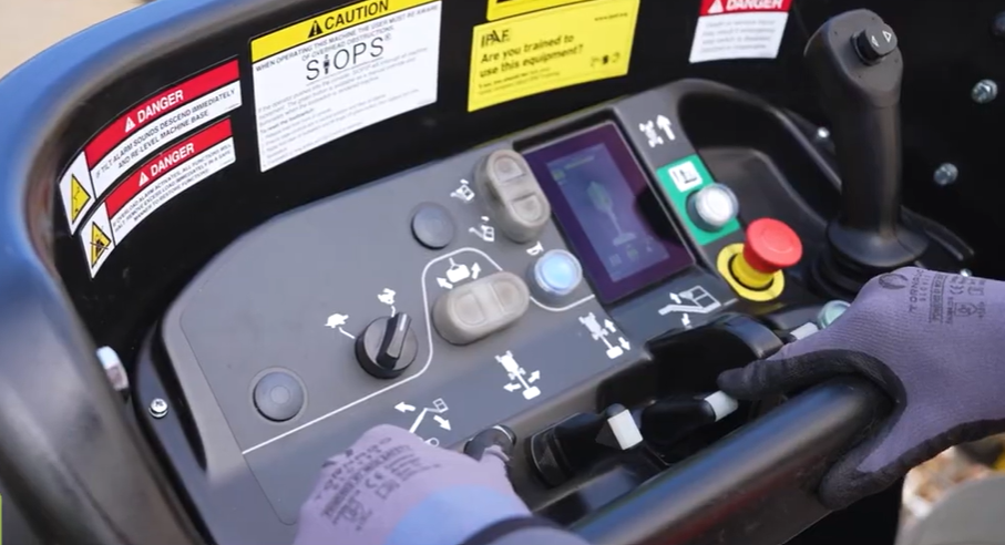
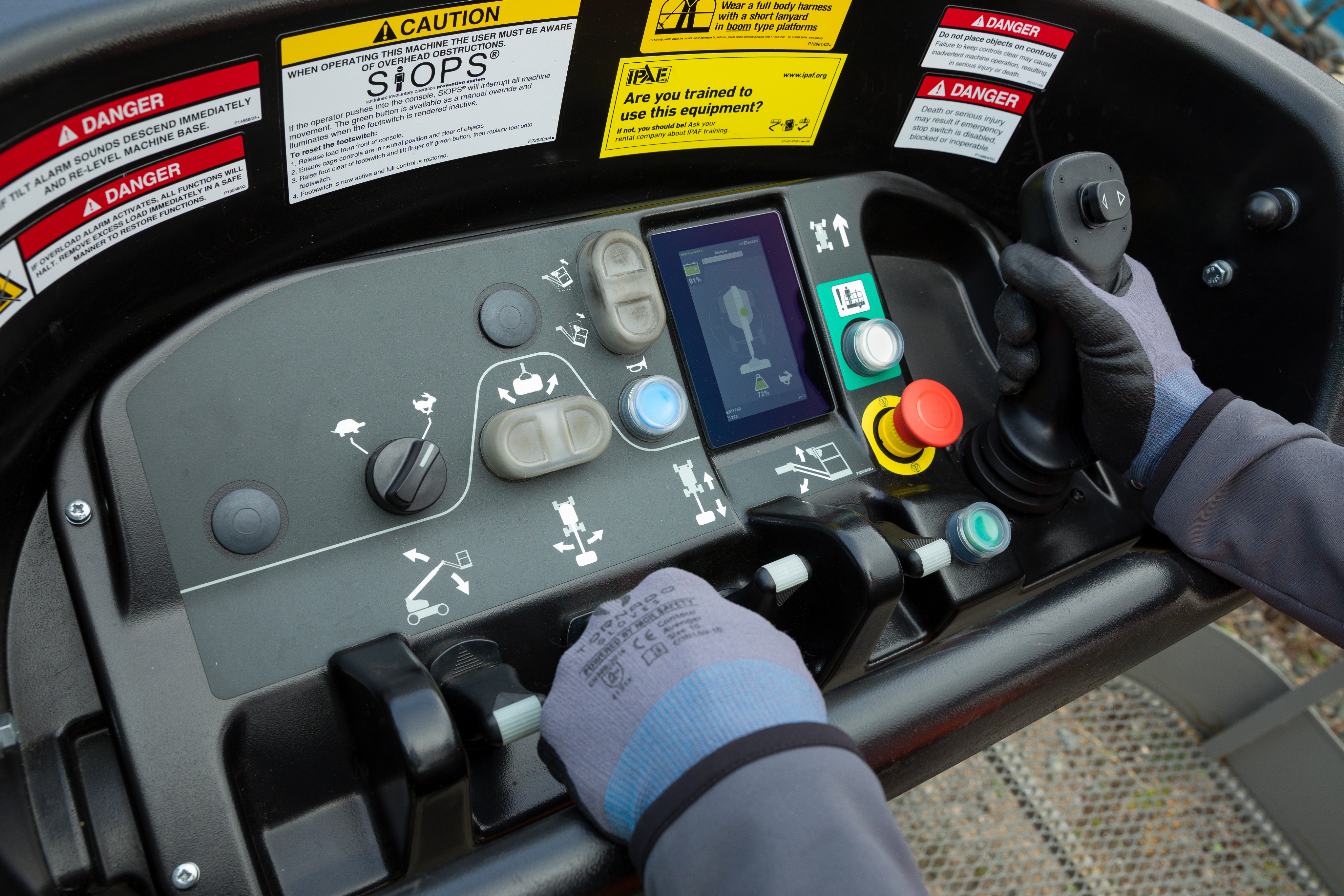
A safer, smarter operator display
Crafting a modern interface that helps machine operators navigate equipment with ease and accuracy.
UX Design
UI Design
Accessability
User Resarch
User Resarch
Adobe Suite
Adobe XD

Behind the brief
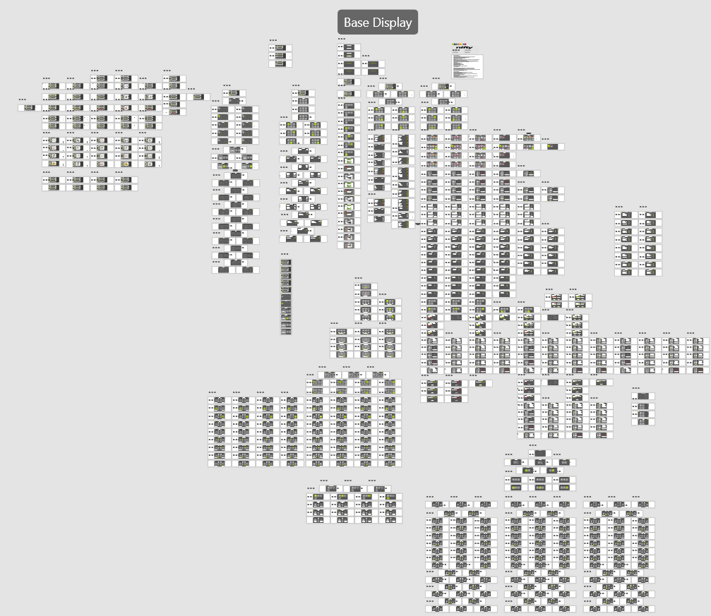
While working as a Product Designer at Niftylift, I led the design of the operator interface for their next-generation machine display. Collaborating closely with in-house software engineers and external manufacturing teams in China, I transformed complex machine behaviours into a clear, safety-driven interface. From early interaction models to reviewing physical hardware samples, I shaped the display’s visual language, interaction patterns, and task flows, ensuring it remained intuitive and reliable in tough, real-world environments.
My role
Product Designer (at Niftylift)
Responsible for defining and delivering the entire interaction model for the operator display. I led the design process end-to-end; research, IA, flows, wireframes, prototypes, and UI specifications.
How I contributed
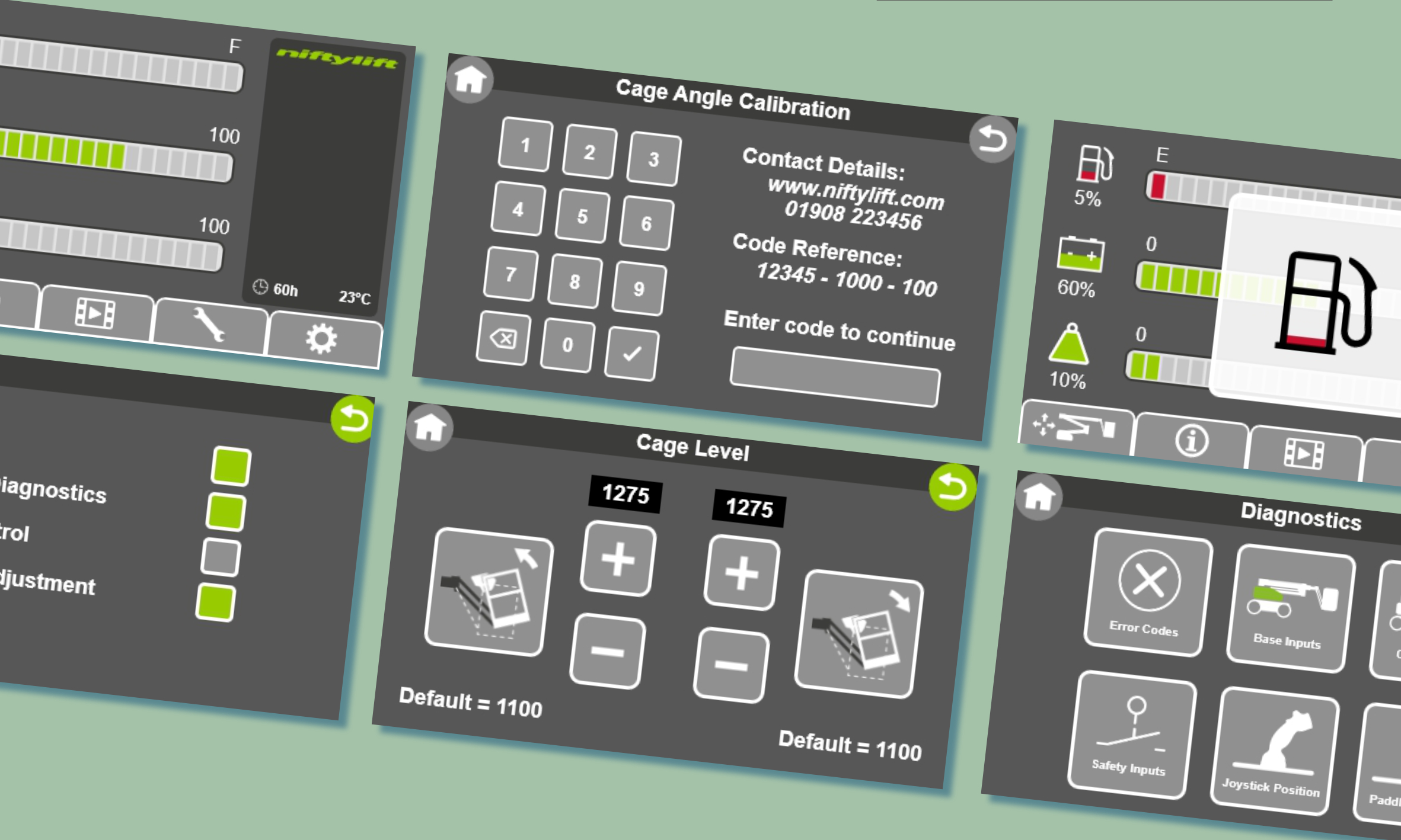
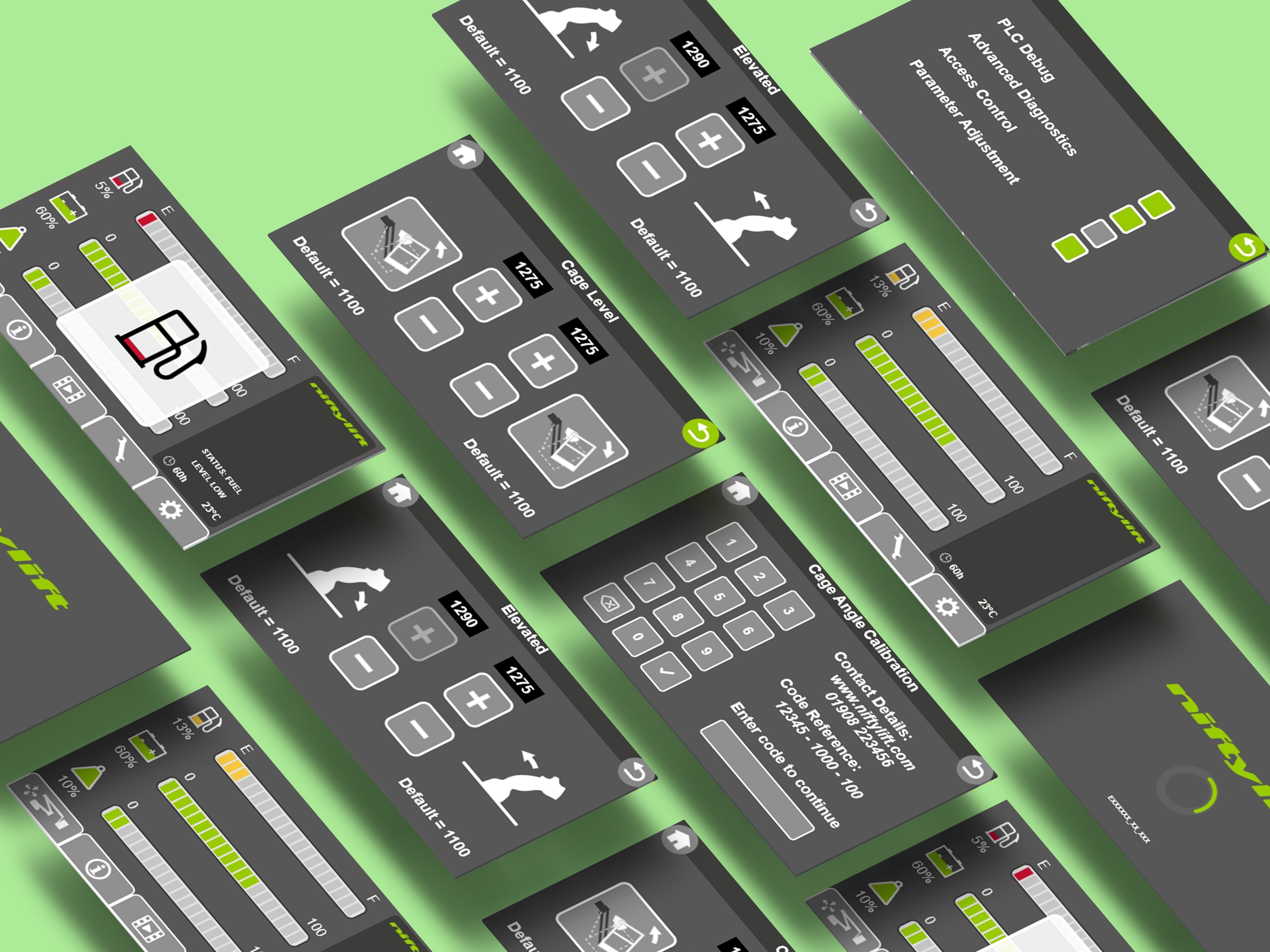
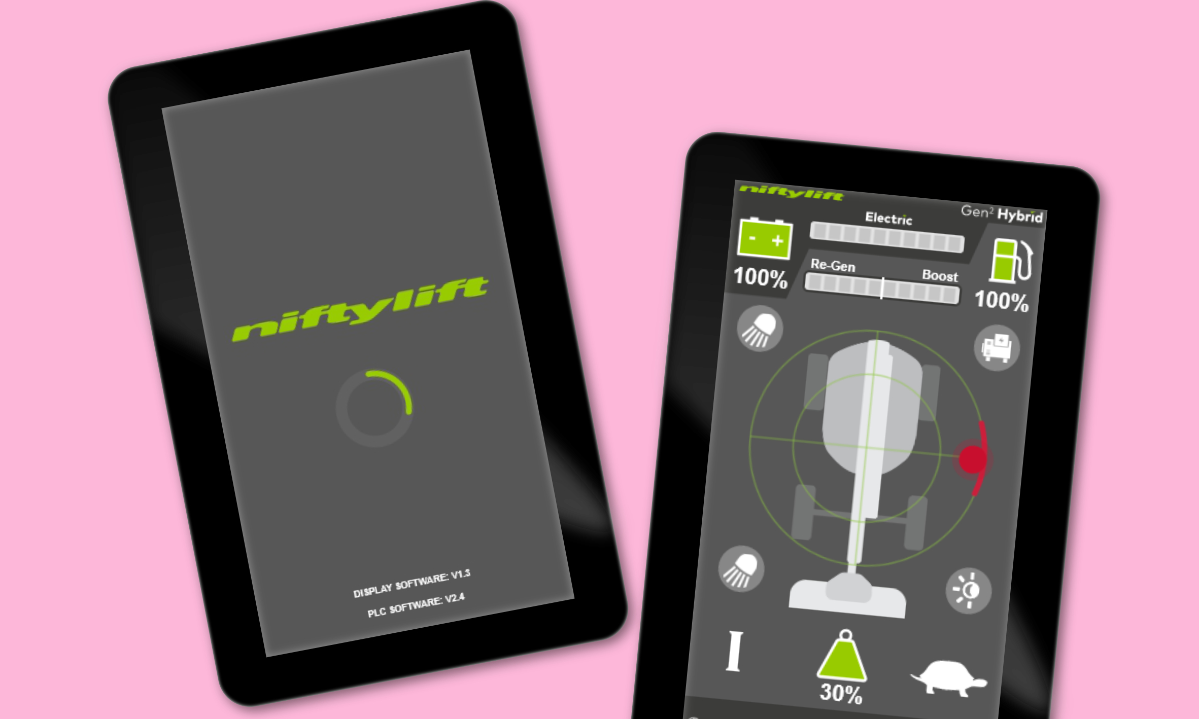
- A full UI system for the operator display, including navigation, fault logic, and task workflows.
- Interactive prototypes used for engineering alignment and field testing.
- Streamlined navigation, clearer fault signalling, and improved task flows.
What I delivered
- Designed all screens, interactions, and behaviour logic for the display.
- Partnered with software engineers and overseas manufacturers to ensure design feasibility.
- Prototyped, tested, and iterated to reduce cognitive load and user error and improve the designs.

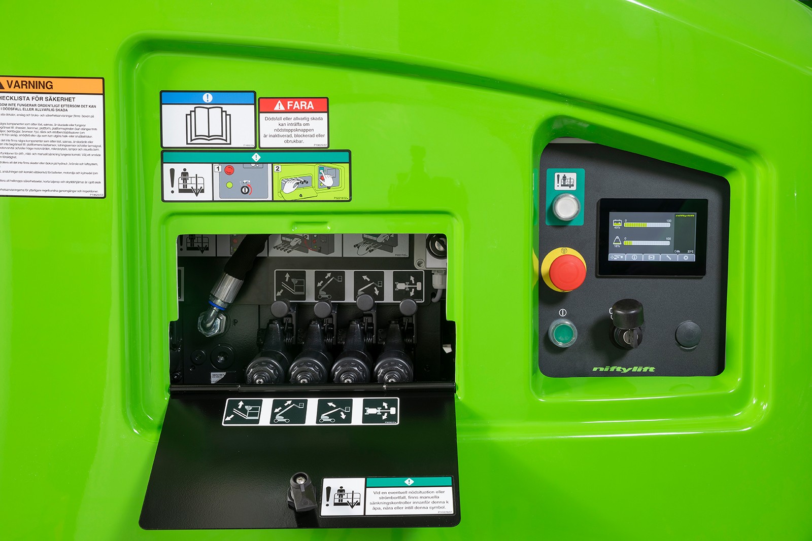
Built for real operators in real conditions
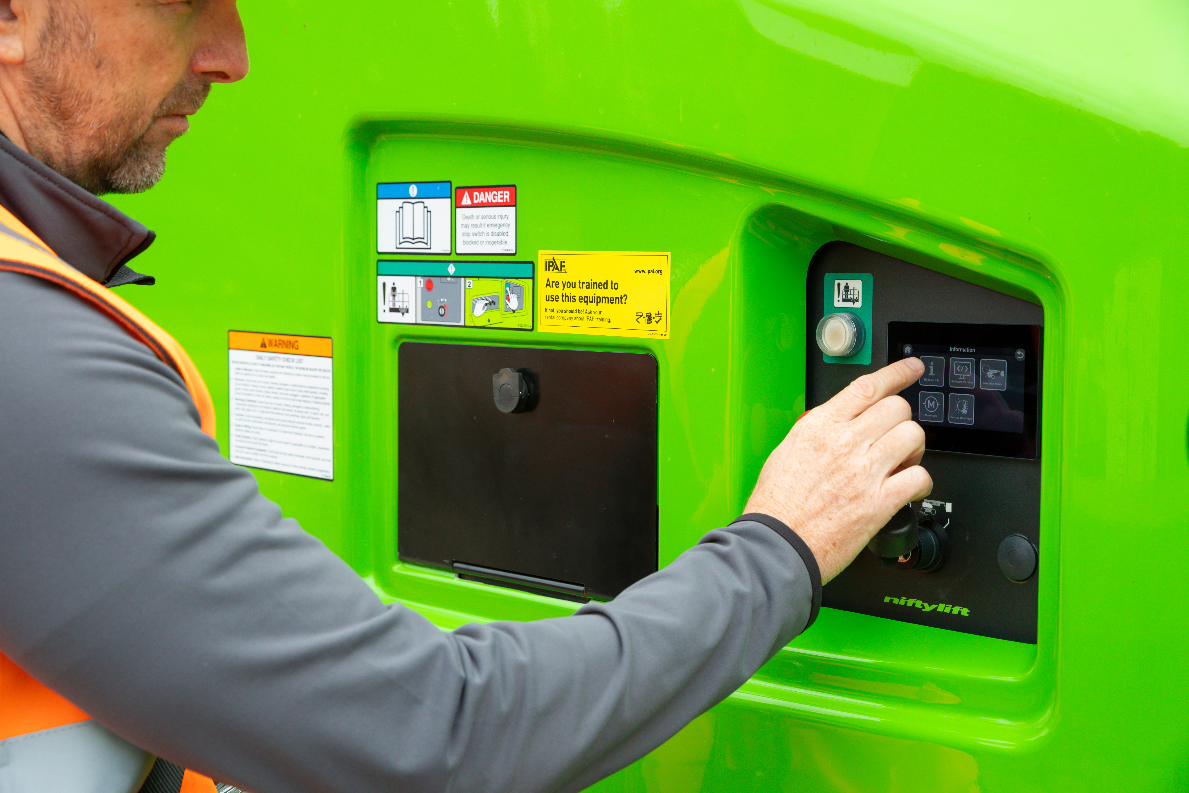
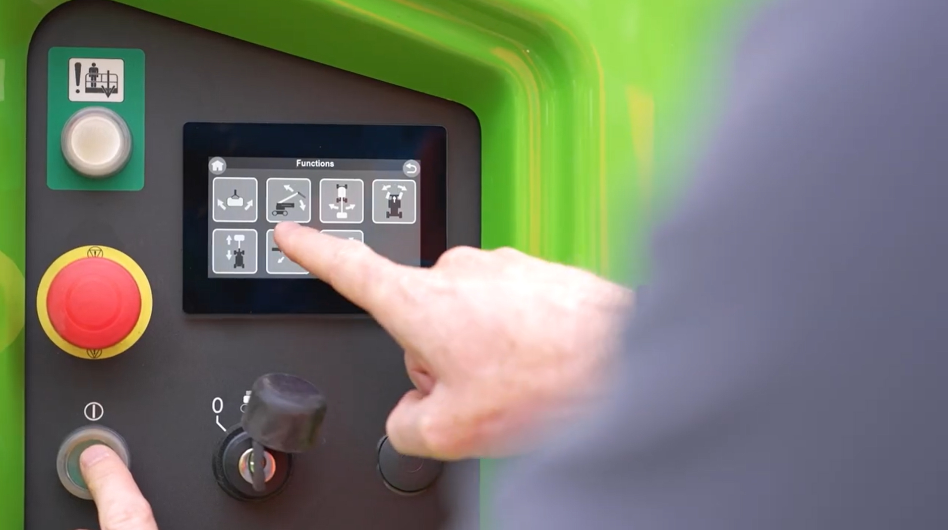
Operators don’t interact with these machines in ideal conditions. They’re outdoors, wearing gloves, dealing with weather, noise, time pressure and sometimes split-second decisions. The interface needed to support them, not slow them down. By focusing on clear hierarchy, bold interaction patterns and simplified task flows, we created a system that reduces errors, speeds up onboarding, and makes critical information instantly readable. The goal was simple: an experience that feels intuitive from the first use and stays reliable in the environments where it matters most.
Clarity that supports safer operation
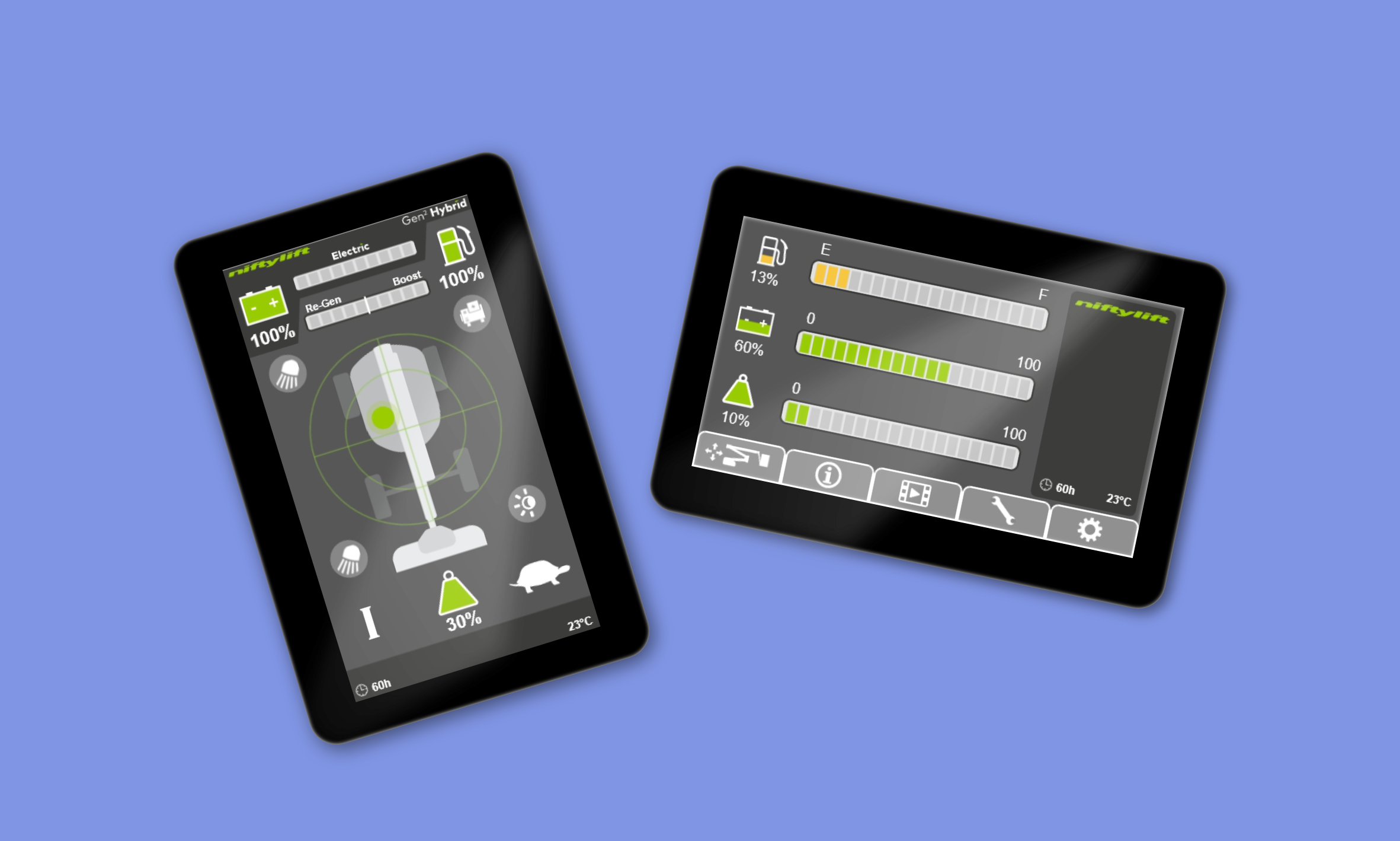
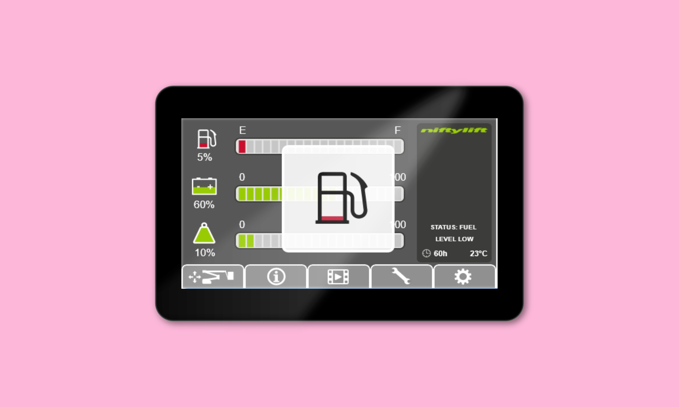
The redesigned interface distilled complex machine states into simple, readable visuals, helping operators understand status and risks at a glance.
Efficiency built into every interaction
Streamlined flows reduced the number of steps required to perform common tasks, improving speed and lowering cognitive load for new operators.
Designed for real-world conditions
From sunlight readability to glove-friendly touch targets, the UI was shaped around the realities of construction environments, not lab conditions.

How it all came together
From prototype to production; turning research, requirements, and constraints into an interface operators can trust.


More work worth exploring
From digital products to brand experiences, a curated selection of my work.
UX/UI
Accessibility
Prototyping
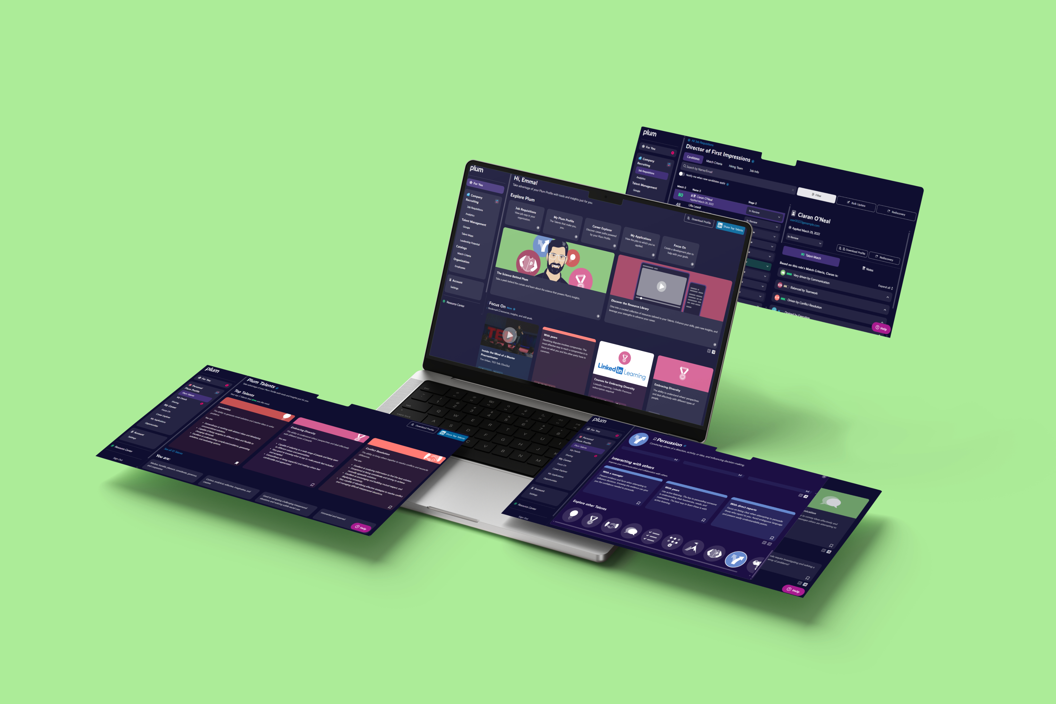
Designing for smarter hiring decisions
Making complex talent insights simple and human.

UX/UI
Branding
Web Design
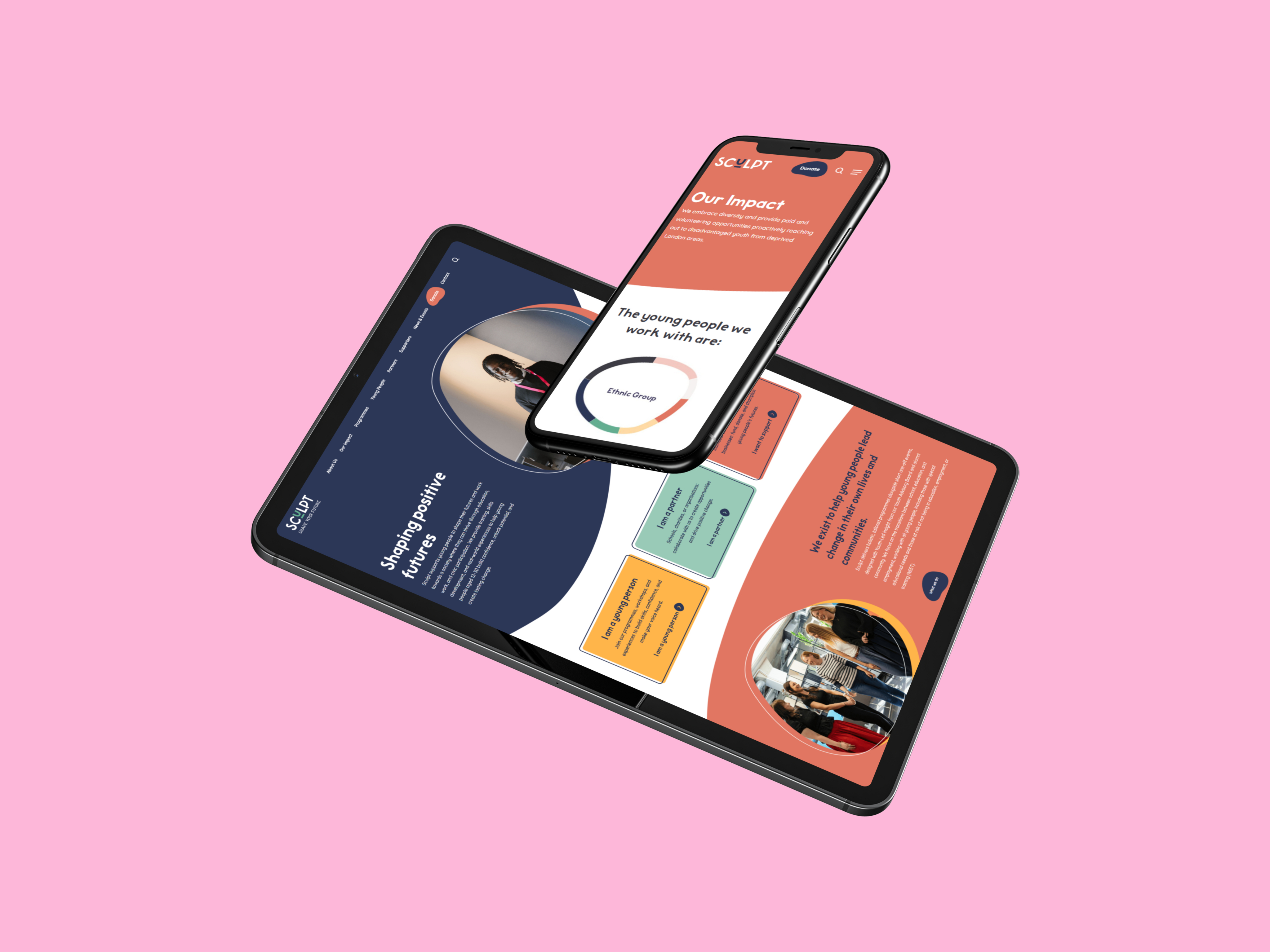
Helping a youth charity show up with confidence
Brand and digital redesign focused on clarity and trust.
UX/UI
Branding
Visual Identity
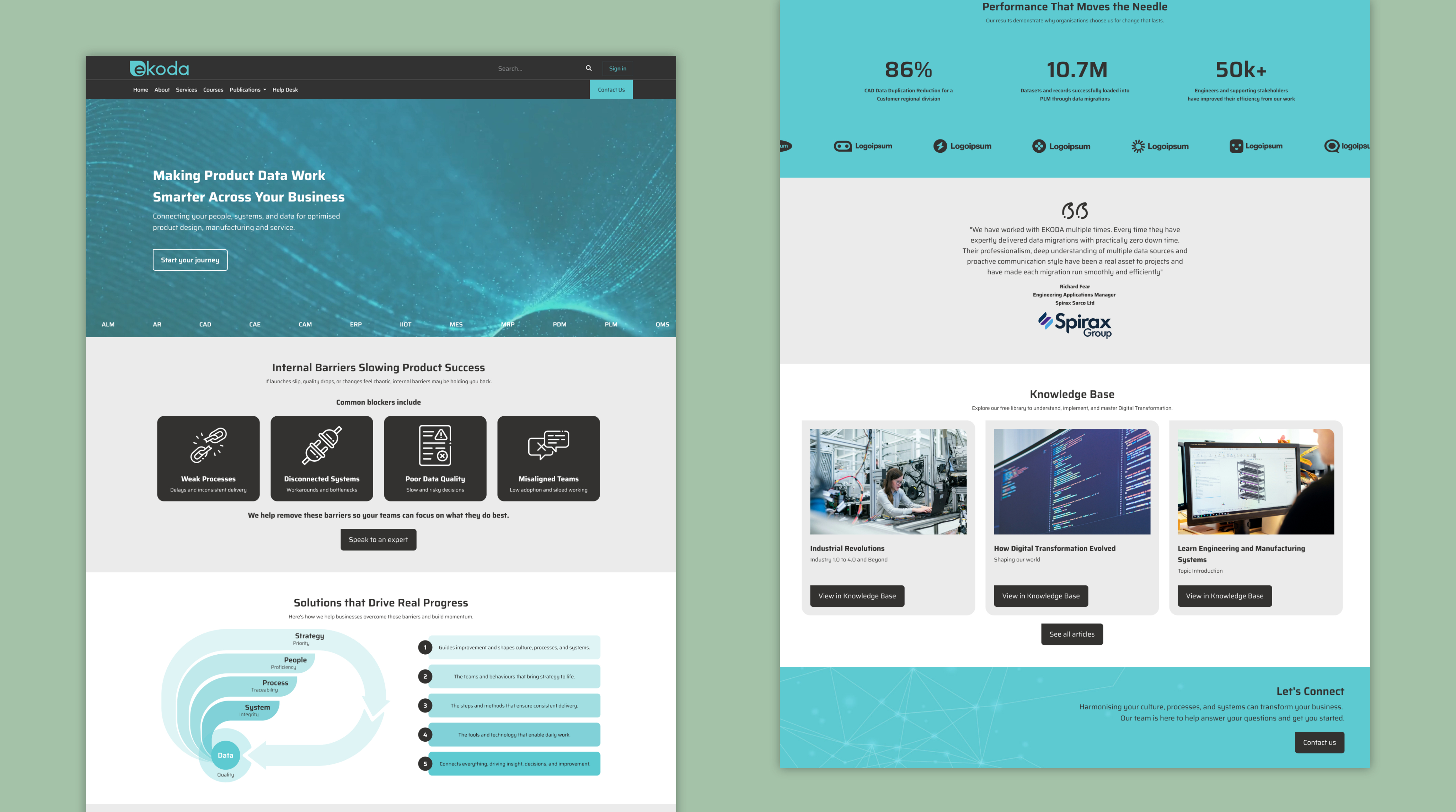
Rebranding a digital consultancy
Creating a cohesive identity and website to support growth
See all projects


A safer, smarter operator display
Crafting a modern interface that helps machine operators navigate equipment with ease and accuracy.
UX Design
UI Design
Accessability
User Resarch
User Resarch
Adobe Suite
Adobe XD
Behind the brief
While working as a Product Designer at Niftylift, I led the design of the operator interface for their next-generation machine display. Collaborating closely with in-house software engineers and external manufacturing teams in China, I transformed complex machine behaviours into a clear, safety-driven interface. From early interaction models to reviewing physical hardware samples, I shaped the display’s visual language, interaction patterns, and task flows, ensuring it remained intuitive and reliable in tough, real-world environments.
My role
Product Designer (at Niftylift)
Responsible for defining and delivering the entire interaction model for the operator display. I led the design process end-to-end; research, IA, flows, wireframes, prototypes, and UI specifications.
How I contributed
- A full UI system for the operator display, including navigation, fault logic, and task workflows.
- Interactive prototypes used for engineering alignment and field testing.
- Streamlined navigation, clearer fault signalling, and improved task flows.
What I delivered
- Designed all screens, interactions, and behaviour logic for the display.
- Partnered with software engineers and overseas manufacturers to ensure design feasibility.
- Prototyped, tested, and iterated to reduce cognitive load and user error and improve the designs.
Built for real operators in real conditions
Operators don’t interact with these machines in ideal conditions. They’re outdoors, wearing gloves, dealing with weather, noise, time pressure and sometimes split-second decisions. The interface needed to support them, not slow them down. By focusing on clear hierarchy, bold interaction patterns and simplified task flows, we created a system that reduces errors, speeds up onboarding, and makes critical information instantly readable. The goal was simple: an experience that feels intuitive from the first use and stays reliable in the environments where it matters most.
Clarity that supports safer operation
The redesigned interface distilled complex machine states into simple, readable visuals, helping operators understand status and risks at a glance.
Efficiency built into every interaction
Streamlined flows reduced the number of steps required to perform common tasks, improving speed and lowering cognitive load for new operators.
Designed for real-world conditions
From sunlight readability to glove-friendly touch targets, the UI was shaped around the realities of construction environments, not lab conditions.
How it all came together
From prototype to production; turning research, requirements, and constraints into an interface operators can trust.
More work worth exploring
From digital products to brand experiences, a curated selection of my work.
UX/UI
Accessibility
Prototyping
Designing for smarter hiring decisions
Making complex talent insights simple and human.
UX/UI
Branding
Web Design
Helping a youth charity show up with confidence
Brand and digital redesign focused on clarity and trust.
UX/UI
Branding
Visual Identity
Rebranding a digital consultancy
Creating a cohesive identity and website to support growth
See all projects
A safer, smarter operator display
Crafting a modern interface that helps machine operators navigate equipment with ease and accuracy.
UX Design
UI Design
Prototyping
User Research
HMI Design
Adobe Suite
Adobe XD
Behind the brief
While working as a Product Designer at Niftylift, I led the design of the operator interface for their next-generation machine display. Collaborating closely with in-house software engineers and external manufacturing teams in China, I transformed complex machine behaviours into a clear, safety-driven interface. From early interaction models to reviewing physical hardware samples, I shaped the display’s visual language, interaction patterns, and task flows, ensuring it remained intuitive and reliable in tough, real-world environments.
My role
Product Designer (at Niftylift)
Responsible for defining and delivering the entire interaction model for the operator display. I led the design process end-to-end; research, IA, flows, wireframes, prototypes, and UI specifications.
How I contributed
- A full UI system for the operator display, including navigation, fault logic, and task workflows.
- Interactive prototypes used for engineering alignment and field testing.
- Streamlined navigation, clearer fault signalling, and improved task flows.
What I delivered
- Designed all screens, interactions, and behaviour logic for the display.
- Partnered with software engineers and overseas manufacturers to ensure design feasibility.
- Prototyped, tested, and iterated to reduce cognitive load and user error and improve the designs.
Built for real operators in real conditions
Operators don’t interact with these machines in ideal conditions. They’re outdoors, wearing gloves, dealing with weather, noise, time pressure and sometimes split-second decisions. The interface needed to support them, not slow them down. By focusing on clear hierarchy, bold interaction patterns and simplified task flows, we created a system that reduces errors, speeds up onboarding, and makes critical information instantly readable. The goal was simple: an experience that feels intuitive from the first use and stays reliable in the environments where it matters most.
Clarity that supports safer operation
The redesigned interface transforms complex machine states into simple, readable visuals, helping operators understand status and risks at a glance.
Efficiency built into every interaction
Streamlined flows reduced the number of steps required to perform common tasks, improving speed and lowering cognitive load for new operators.
Designed for real-world conditions
From sunlight readability to glove-friendly touch targets, the UI was shaped around the realities of construction environments, not lab conditions.

How it all came together
From prototype to production; turning research, requirements, and constraints into an interface operators can trust.
More work worth exploring
From digital products to brand experiences, a curated selection of my work.
UX/UI
Accessibility
Prototyping
Designing for smarter hiring decisions
Making complex talent insights simple and human.
UX/UI
Branding
Web Design
Helping a youth charity show up with confidence
Brand and digital redesign focused on clarity and trust.
UX/UI
Branding
Visual Identity
Rebranding a digital consultancy
Creating a cohesive identity and website to support growth
See all projects