
Designing clarity into a complex talent platform
Evolving a data-heavy assessment and hiring experience through research-led, measurable UX improvements.
UX/UI Design
Product Design
Accessability
B2B/B2C SaaS
Adobe Suite
Figma
Pendo
Useberry
JIRA
Mural
Zendesk

The context
Over the last several years, I’ve worked on a large-scale talent assessment and hiring platform used by candidates, recruiters, and hiring managers. The product surfaces complex behavioural data and insights that need to be accurate, fair, and easy to understand, often for users encountering this type of information for the first time.
My role focused on improving clarity, engagement, and accessibility across core experiences, while supporting business goals around adoption, differentiation, and trust.

What I owned
- Led end-to-end UX design across key candidate and recruiter experiences
- Translated complex behavioural data into clear, actionable interfaces
- Used analytics, user feedback, and usability testing to guide design decisions
- Owned accessibility standards and audits across the platform
- Presented monthly UX insights and KPIs to product leadership

Key initiatives
A selection of initiatives that shaped the platform experience.
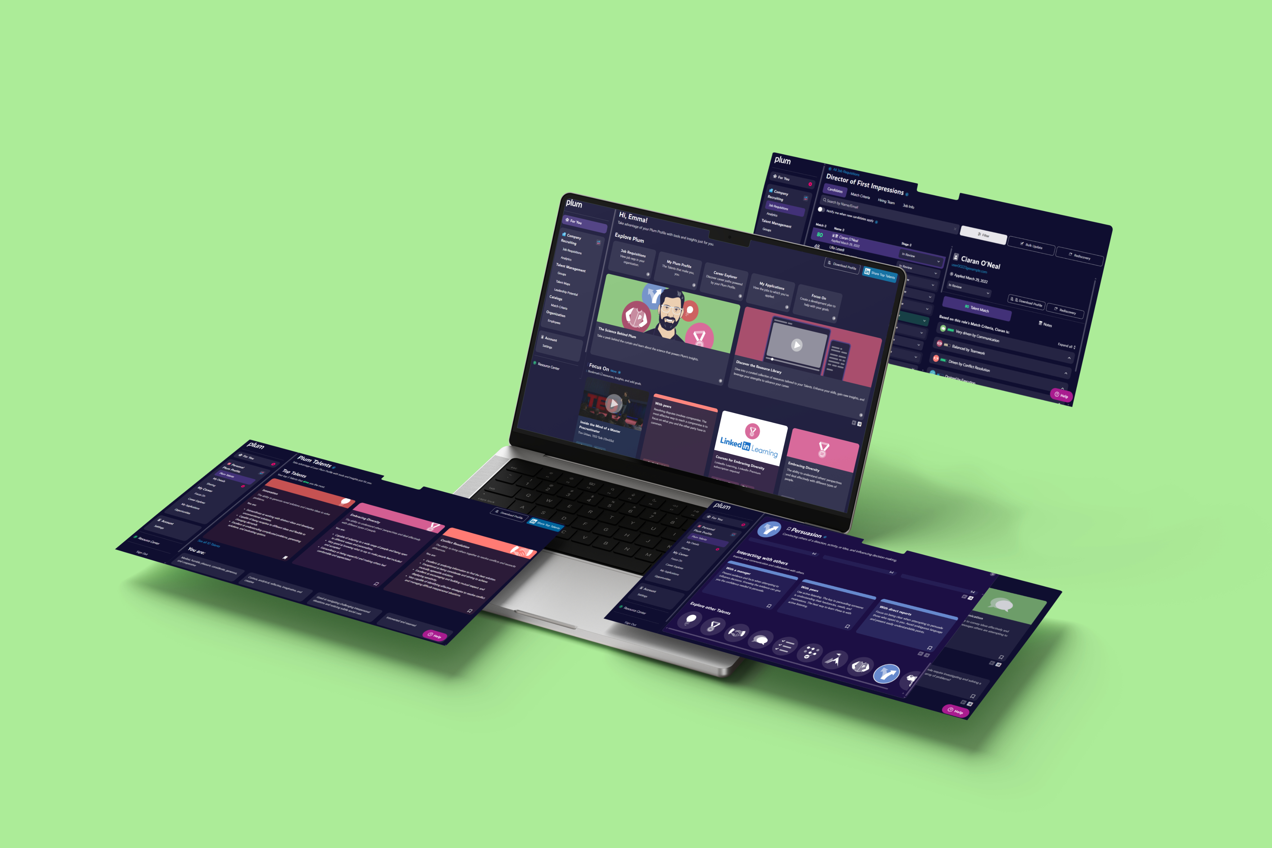
Reimagining the candidate profile experience
The problem
The redesigned interface distilled complex machine states into simple, readable visuals, helping operators understand status and risks at a glance.
Approach
The redesigned interface distilled complex machine states into simple, readable visuals, helping operators understand status and risks at a glance.
Outcome
The redesigned interface distilled complex machine states into simple, readable visuals, helping operators understand status and risks at a glance.
Designing a career exploration experience
The problem
The redesigned interface distilled complex machine states into simple, readable visuals, helping operators understand status and risks at a glance.
Approach
The redesigned interface distilled complex machine states into simple, readable visuals, helping operators understand status and risks at a glance.
Outcome
The redesigned interface distilled complex machine states into simple, readable visuals, helping operators understand status and risks at a glance.
Improving match visualisation for recruiters
The problem
The redesigned interface distilled complex machine states into simple, readable visuals, helping operators understand status and risks at a glance.
Approach
The redesigned interface distilled complex machine states into simple, readable visuals, helping operators understand status and risks at a glance.
Outcome
The redesigned interface distilled complex machine states into simple, readable visuals, helping operators understand status and risks at a glance.
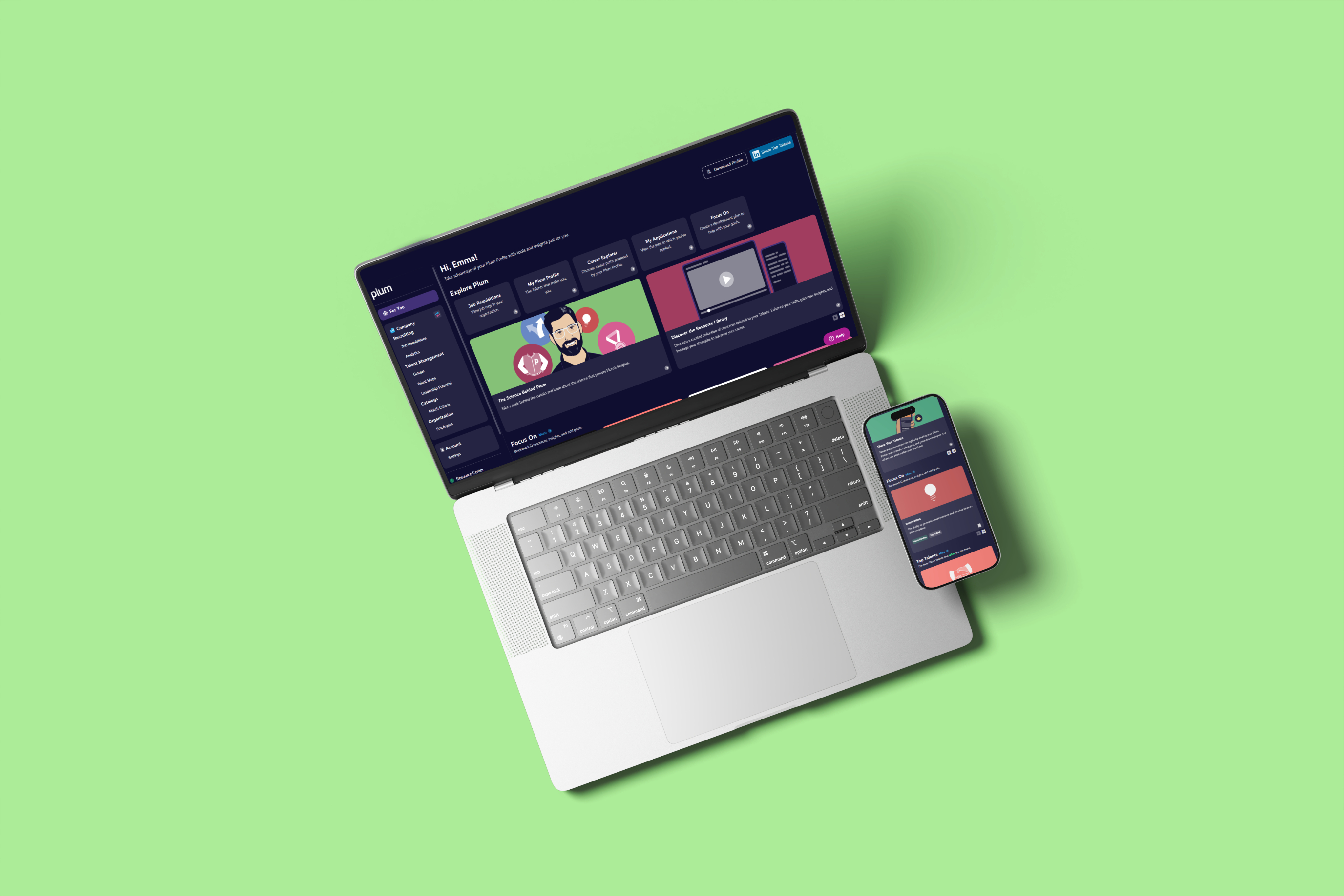
Designing a personalised entry point
The problem
Users were landing in different parts of the platform based on complex role and permission logic. This created confusion, made onboarding inconsistent, and limited our ability to guide users toward meaningful next steps. The experience also wasn’t designed to evolve. Adding new features or messaging required rethinking navigation rather than simply adapting content.
Approach
I designed a single, centralised dashboard that every user lands on when they log in. The experience adapts based on user state, feature access, and progress. This encourages key actions like completing assessments while surfacing relevant content to others users. The layout and module system were intentionally designed to be flexible, allowing new features and messaging to be introduced without disrupting the core experience.
Outcome
The dashboard created a clearer, more consistent entry point for all users while enabling a more dynamic, personalised experience. It reduced complexity, supported key behaviours, and gave the platform a flexible surface designed to grow alongside the product.

Beyond individual features
Alongside feature work, I focused on improving the overall quality and consistency of the platform.
- Conducted a full accessibility audit across the platform and defined an actionable remediation plan.
- Led accessibility demonstrations and Q&A as part of a large enterprise RFP.
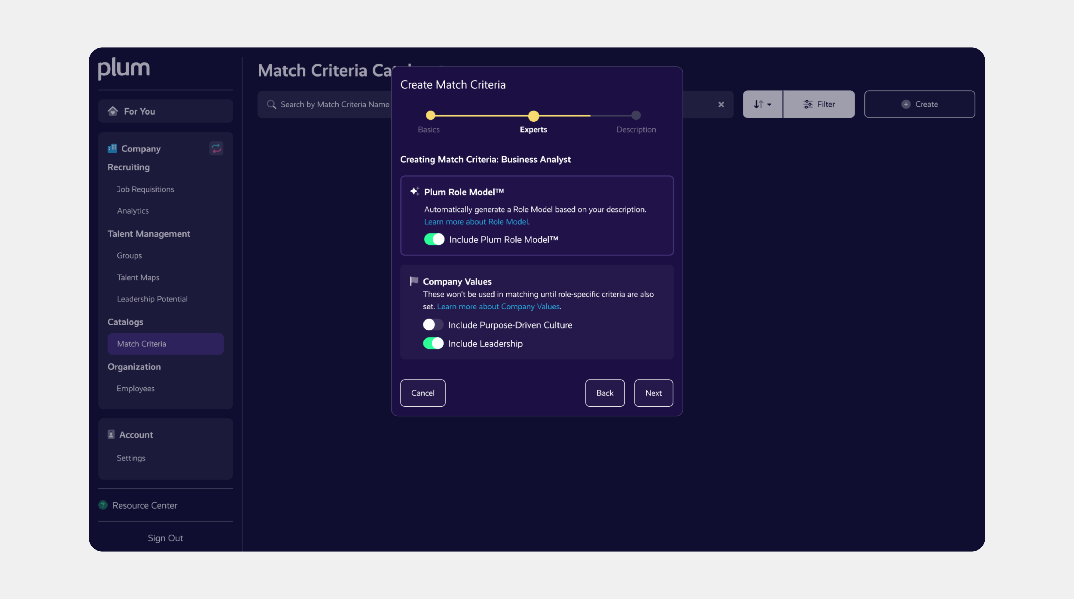
- Established clearer UI patterns for colour, iconography, typography, and interaction consistency.
- Created and maintained a comprehensive design system in Figma, ensuring reusable components, consistent styling, and scalable workflows.
- Redesigned and maintained the Help Center in Zendesk, updating all articles for clarity and coherence, and creating new documentation to reflect evolving platform features.
- Regularly analysed product analytics, support trends, KPI’s, and in-product feedback to inform design priorities.

Measuring impact
Design decisions were guided by ongoing analysis of user behaviour, support trends, and qualitative feedback. Improvements contributed to increased engagement with candidate profiles, clearer recruiter decision-making, and stronger differentiation around usability and accessibility.

How it shows up in the product
A showcase of the brand and website redesign in action.

What this work reinforced
Designing in complex, data-heavy environments is less about adding features and more about reducing cognitive load. These projects reinforced the importance of clarity, consistency, and empathy. Especially when users are making decisions that can meaningfully impact people’s careers.

More work worth exploring
From digital products to brand experiences, a curated selection of my work.
UX/UI
User Research
Prototyping
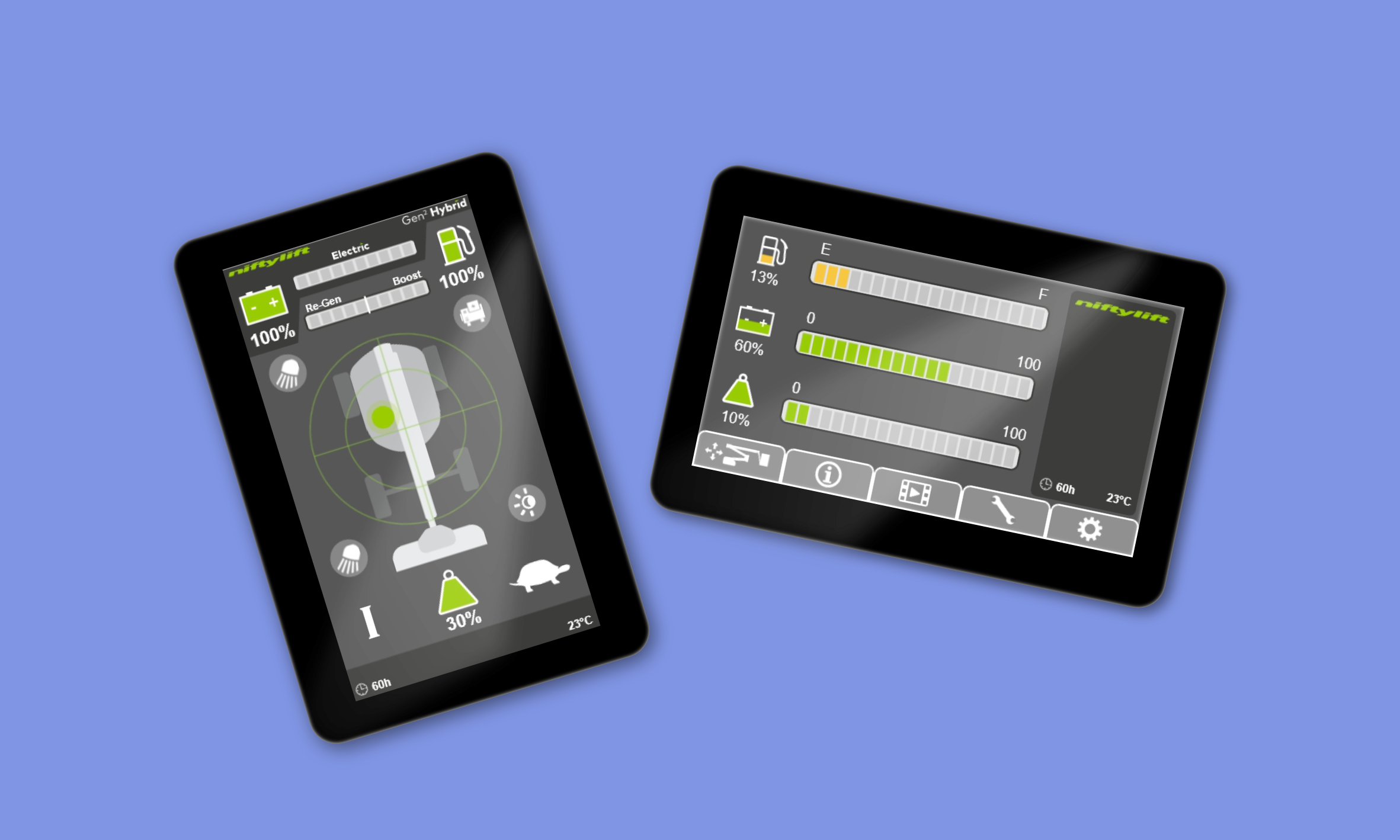
Redefining the operator experience
Designing intuitive machine interfaces to improve safety and efficiency.

UX/UI
Branding
Web Design
Redefining the operator experience
Designing intuitive machine interfaces to improve safety and efficiency.
UX/UI
Branding
Visual Identity
Rebranding a digital consultancy
Creating a cohesive identity and website to support growth
See all projects


Designing clarity into a complex talent platform
Evolving a data-heavy assessment and hiring experience through research-led, measurable UX improvements.
UX/UI Design
Product Design
Accessability
B2B/B2C SaaS
Adobe Suite
Figma
Pendo
Useberry
JIRA
Mural
Zendesk
The context
Over the last several years, I’ve worked on a large-scale talent assessment and hiring platform used by candidates, recruiters, and hiring managers. The product surfaces complex behavioural data and insights that need to be accurate, fair, and easy to understand, often for users encountering this type of information for the first time.
My role focused on improving clarity, engagement, and accessibility across core experiences, while supporting business goals around adoption, differentiation, and trust.
What I owned
- Led end-to-end UX design across key candidate and recruiter experiences
- Translated complex behavioural data into clear, actionable interfaces
- Used analytics, user feedback, and usability testing to guide design decisions
- Owned accessibility standards and audits across the platform
- Presented monthly UX insights and KPIs to product leadership
Key initiatives
A selection of initiatives that shaped the platform experience.
Reimagining the candidate profile experience
The problem
The redesigned interface distilled complex machine states into simple, readable visuals, helping operators understand status and risks at a glance.
Approach
The redesigned interface distilled complex machine states into simple, readable visuals, helping operators understand status and risks at a glance.
Outcome
The redesigned interface distilled complex machine states into simple, readable visuals, helping operators understand status and risks at a glance.
Designing a career exploration experience
The problem
The redesigned interface distilled complex machine states into simple, readable visuals, helping operators understand status and risks at a glance.
Approach
The redesigned interface distilled complex machine states into simple, readable visuals, helping operators understand status and risks at a glance.
Outcome
The redesigned interface distilled complex machine states into simple, readable visuals, helping operators understand status and risks at a glance.
Improving match visualisation for recruiters
The problem
The redesigned interface distilled complex machine states into simple, readable visuals, helping operators understand status and risks at a glance.
Approach
The redesigned interface distilled complex machine states into simple, readable visuals, helping operators understand status and risks at a glance.
Outcome
The redesigned interface distilled complex machine states into simple, readable visuals, helping operators understand status and risks at a glance.
Designing a personalised entry point
The problem
Users were landing in different parts of the platform based on complex role and permission logic. This created confusion, made onboarding inconsistent, and limited our ability to guide users toward meaningful next steps. The experience also wasn’t designed to evolve. Adding new features or messaging required rethinking navigation rather than simply adapting content.
Approach
I designed a single, centralised dashboard that every user lands on when they log in. The experience adapts based on user state, feature access, and progress. This encourages key actions like completing assessments while surfacing relevant content to others users. The layout and module system were intentionally designed to be flexible, allowing new features and messaging to be introduced without disrupting the core experience.
Outcome
The dashboard created a clearer, more consistent entry point for all users while enabling a more dynamic, personalised experience. It reduced complexity, supported key behaviours, and gave the platform a flexible surface designed to grow alongside the product.
Beyond individual features
Alongside feature work, I focused on improving the overall quality and consistency of the platform.
- Conducted a full accessibility audit across the platform and defined an actionable remediation plan.
- Led accessibility demonstrations and Q&A as part of a large enterprise RFP.
- Established clearer UI patterns for colour, iconography, typography, and interaction consistency.
- Created and maintained a comprehensive design system in Figma, ensuring reusable components, consistent styling, and scalable workflows.
- Redesigned and maintained the Help Center in Zendesk, updating all articles for clarity and coherence, and creating new documentation to reflect evolving platform features.
- Regularly analysed product analytics, support trends, KPI’s, and in-product feedback to inform design priorities.
Measuring impact
Design decisions were guided by ongoing analysis of user behaviour, support trends, and qualitative feedback. Improvements contributed to increased engagement with candidate profiles, clearer recruiter decision-making, and stronger differentiation around usability and accessibility.
How it shows up in the product
A showcase of the brand and website redesign in action.
What this work reinforced
Designing in complex, data-heavy environments is less about adding features and more about reducing cognitive load. These projects reinforced the importance of clarity, consistency, and empathy. Especially when users are making decisions that can meaningfully impact people’s careers.
More work worth exploring
From digital products to brand experiences, a curated selection of my work.
UX/UI
User Research
Prototyping
Redefining the operator experience
Designing intuitive machine interfaces to improve safety and efficiency.
UX/UI
Branding
Web Design
Redefining the operator experience
Designing intuitive machine interfaces to improve safety and efficiency.
UX/UI
Branding
Visual Identity
Rebranding a digital consultancy
Creating a cohesive identity and website to support growth
See all projects

Designing clarity into a complex talent platform
Evolving a data-heavy assessment and hiring experience through research-led, measurable UX improvements.
UX/UI Design
Product Design
Accessibility
B2B/B2C SaaS
Adobe Suite
Figma
Pendo
Useberry
JIRA
Mural
Zendesk
The context
Over the last several years, I’ve worked on a large-scale talent assessment and hiring platform used by candidates, recruiters, and hiring managers. The product surfaces complex behavioural data and insights that need to be accurate, fair, and easy to understand, often for users encountering this type of information for the first time.
My role focused on improving clarity, engagement, and accessibility across core experiences, while supporting business goals around adoption, differentiation, and trust.
What I owned
- Led end-to-end UX design across key candidate and recruiter experiences
- Translated complex behavioural data into clear, actionable interfaces
- Used analytics, user feedback, and usability testing to guide design decisions
- Owned accessibility standards and audits across the platform
- Presented monthly UX insights and KPIs to product leadership
Key initiatives
A selection of initiatives that shaped the platform experience.
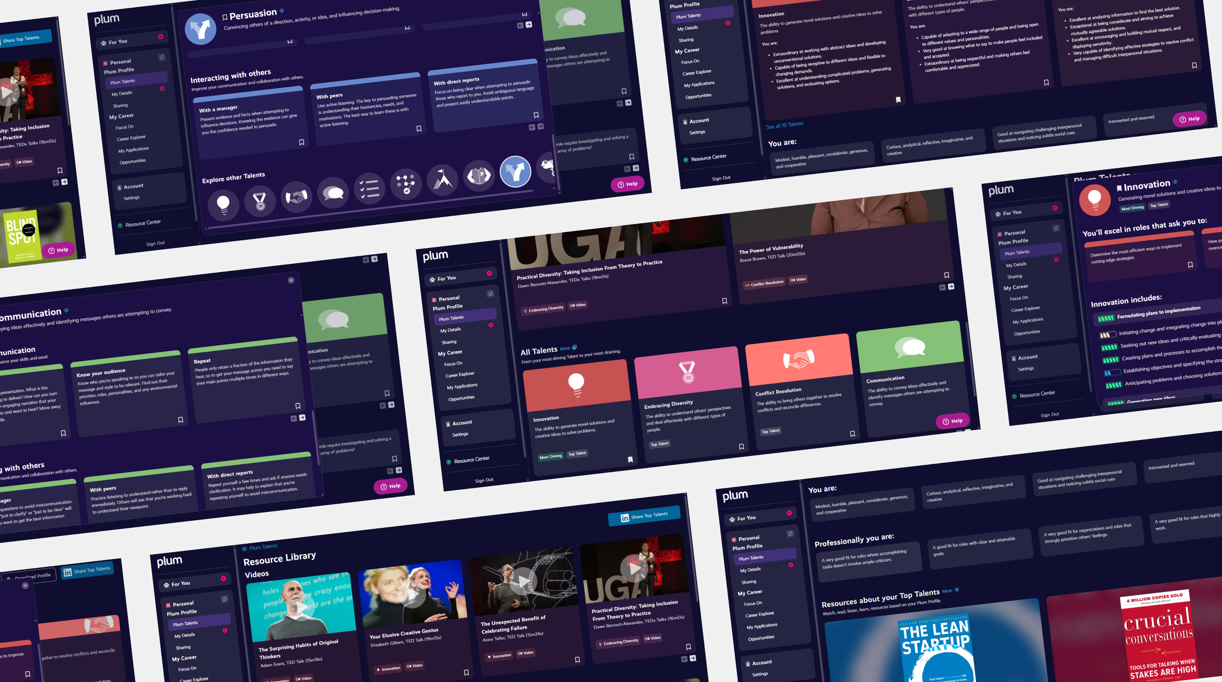
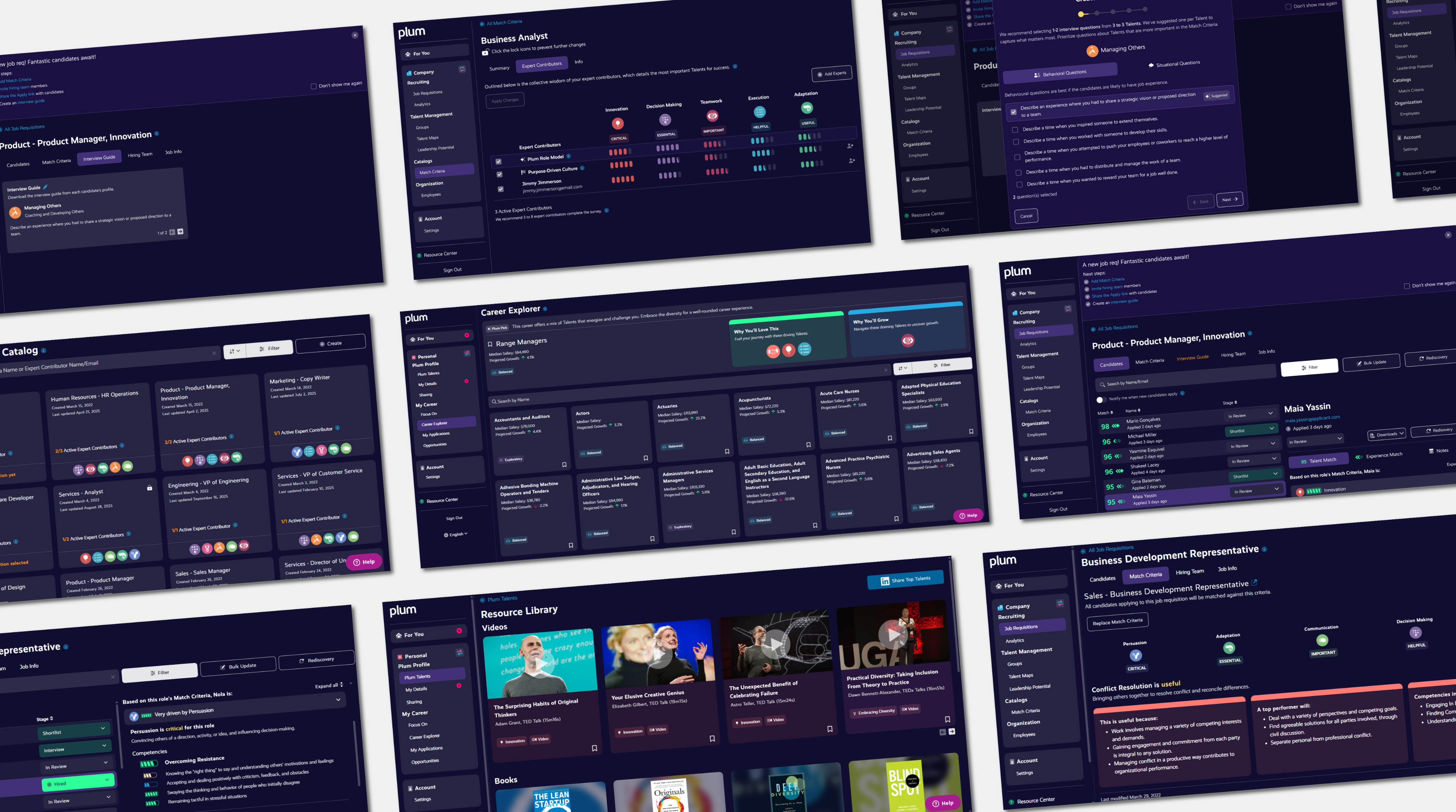
Reimagining the candidate profile experience
The problem
Candidates were shown limited, abstract results that lacked context and personal meaning, reducing engagement and shareability.
Approach
I redesigned the experience into a multi-section, interactive profile that surfaces ranked strengths, behavioural insights, and growth resources, with progressive disclosure for deeper exploration.
Outcome
The updated experience increased engagement, improved understanding of results, and supported sharing and download use cases.
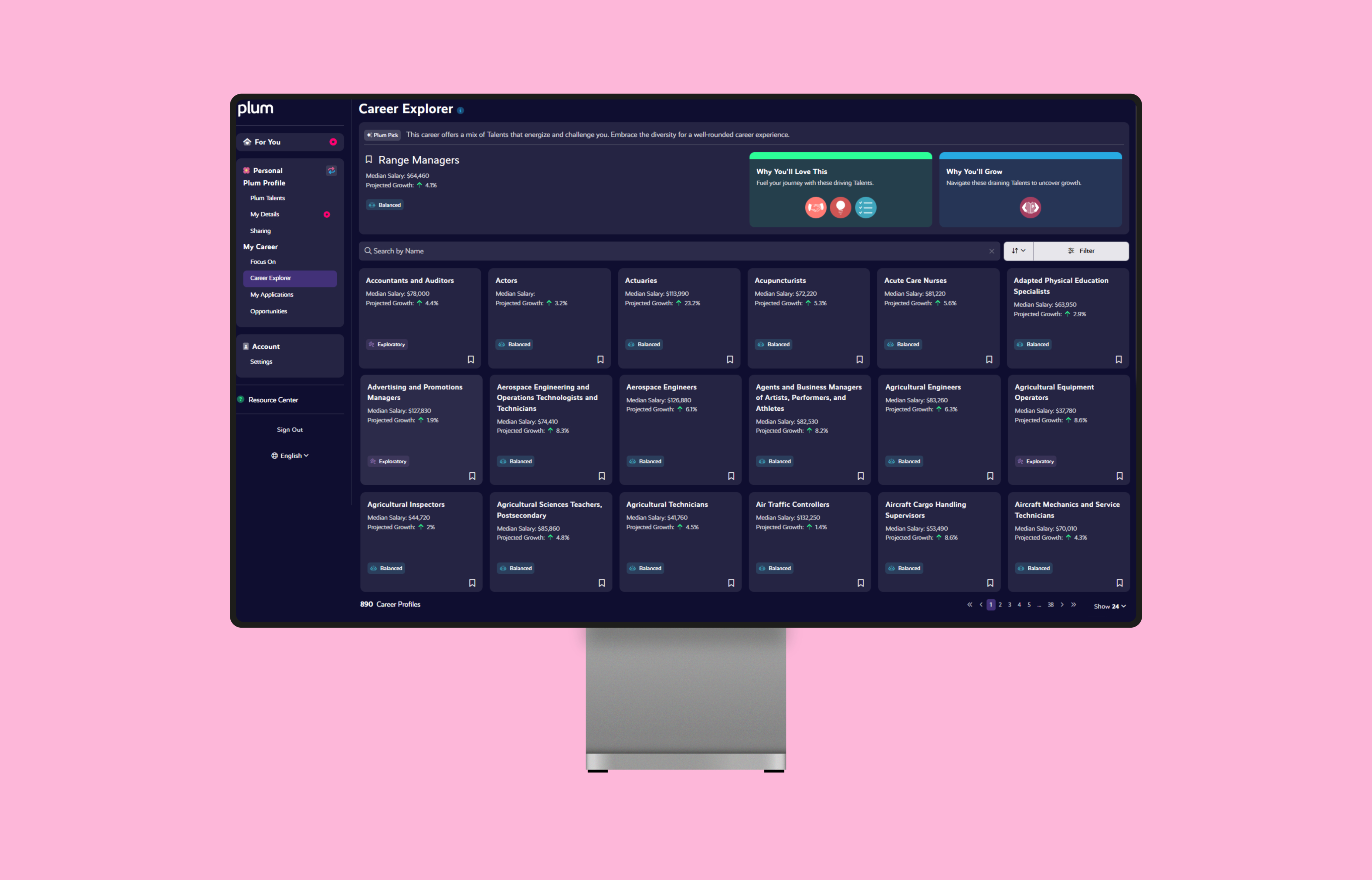
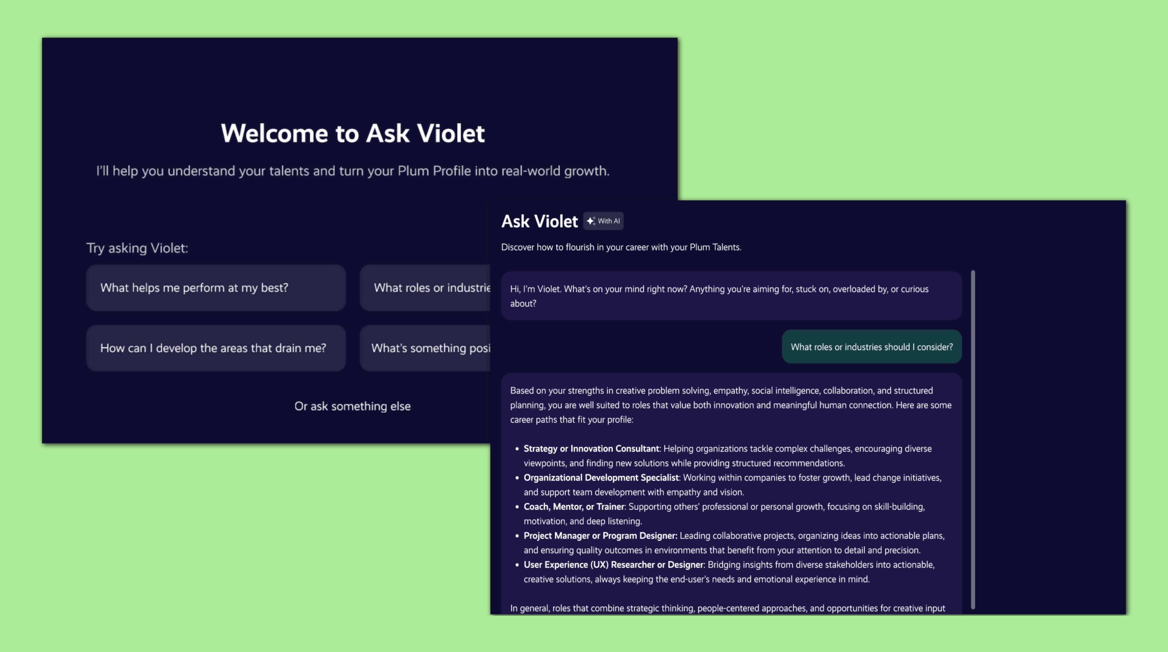
Designing a career exploration experience
The problem
Many users, especially those early in their careers, struggled to translate their assessment results into clear, actionable career direction. The platform explained who they were, but not where that could take them.
Approach
I proposed and designed a new career exploration experience that connected behavioural insights to real-world roles. The feature categorised career paths based on what would be energising or draining for each individual, helping users understand how their strengths might play out across different professions. I pitched the concept to product leadership, outlining both user value and strategic differentiation, and secured approval to move forward.
Outcome
The feature gave users a clearer sense of direction and purpose, particularly those new to the workforce, while positioning the platform as a more holistic career development tool, not just an assessment product.
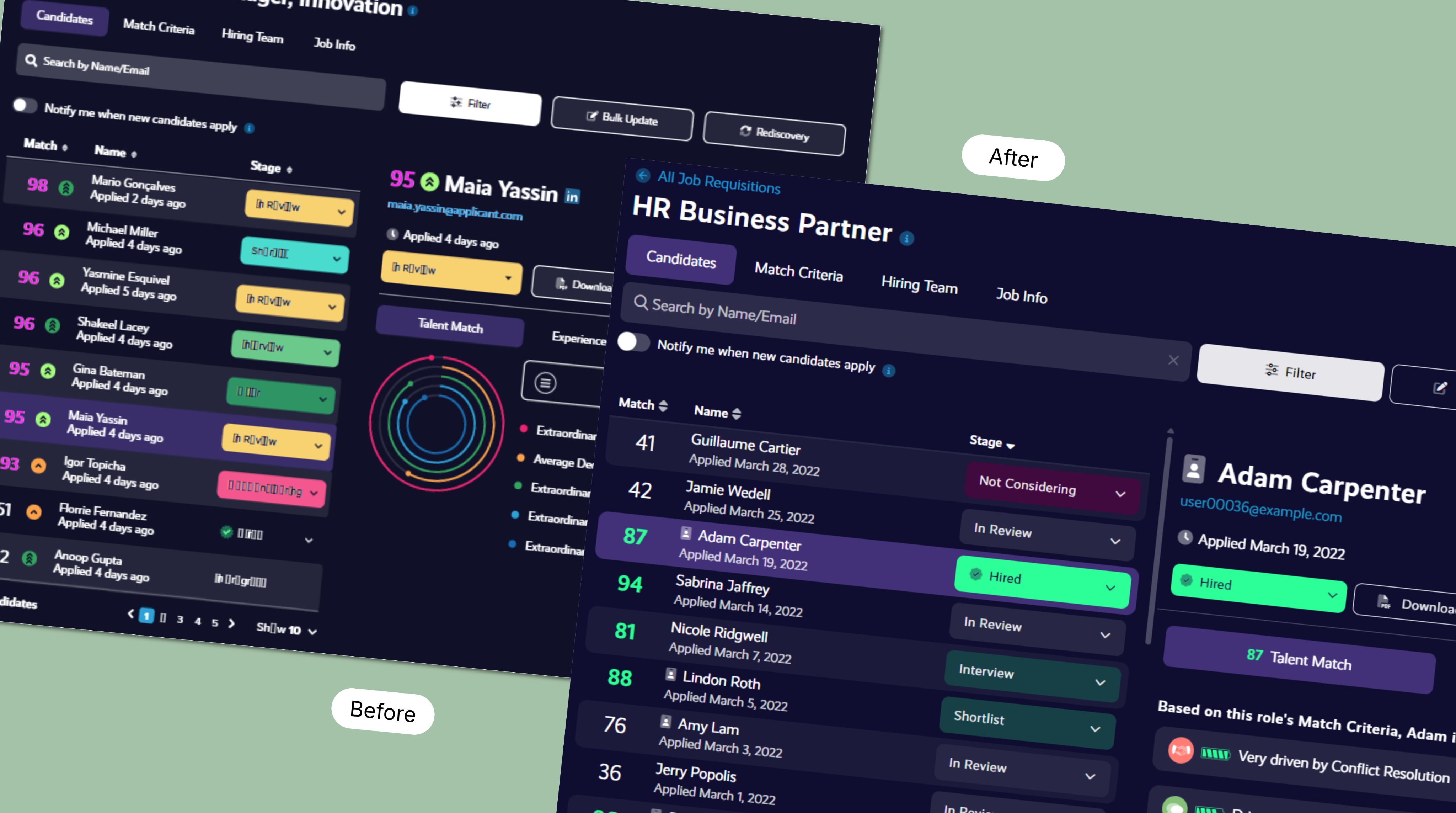
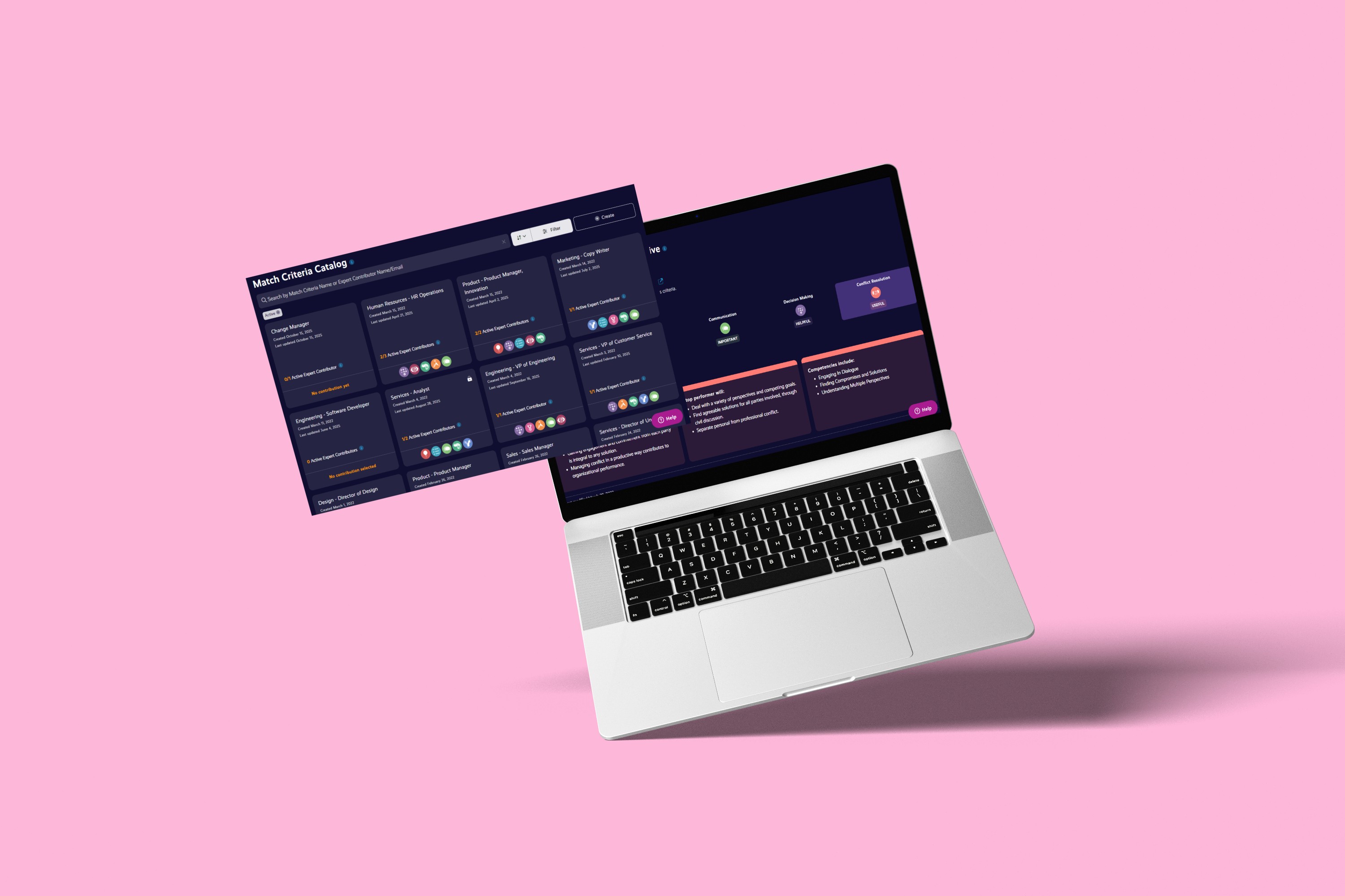
Improving match visualisation for recruiters
The problem
Recruiters found it difficult to quickly interpret and compare candidate matches. Existing visuals were unintuitive, inconsistent with other areas of the platform, and required explanation before they could be confidently used in decision-making.
Approach
I redesigned the match visualisation to prioritise clarity and comparability. By introducing a more intuitive visual language that aligned with patterns already used elsewhere in the product, I reduced the cognitive effort required to understand candidate fit. The focus was on at-a-glance comprehension and consistency across the recruiting experience.
Outcome
The updated visualisation made it easier for recruiters to scan, compare, and discuss candidates, supporting faster decision-making and more confident use of the platform during hiring workflows.
Designing a personalised entry point
The problem
Users were landing in different parts of the platform based on complex role and permission logic. This created confusion, made onboarding inconsistent, and limited our ability to guide users toward meaningful next steps. The experience also wasn’t designed to evolve. Adding new features or messaging required rethinking navigation rather than simply adapting content.
Approach
I designed a single, centralised dashboard that every user lands on when they log in. The experience adapts based on user state, feature access, and progress. This encourages key actions like completing assessments while surfacing relevant content to others users. The layout and module system were intentionally designed to be flexible, allowing new features and messaging to be introduced without disrupting the core experience.
Outcome
The dashboard created a clearer, more consistent entry point for all users while enabling a more dynamic, personalised experience. It reduced complexity, supported key behaviours, and gave the platform a flexible surface designed to grow alongside the product.
Beyond individual features
Alongside feature work, I focused on improving the overall quality and consistency of the platform.
- Conducted a full accessibility audit across the platform and defined an actionable remediation plan.
- Led accessibility demonstrations and Q&A as part of a large enterprise RFP.
- Established clearer UI patterns for colour, iconography, typography, and interaction consistency.
- Created and maintained a comprehensive design system in Figma, ensuring reusable components, consistent styling, and scalable workflows.
- Redesigned and maintained the Help Center in Zendesk, updating all articles for clarity and coherence, and creating new documentation to reflect evolving platform features.
- Regularly analysed product analytics, support trends, KPI’s, and in-product feedback to inform design priorities.
Measuring impact
Design decisions were guided by ongoing analysis of user behaviour, support trends, and qualitative feedback. Improvements contributed to increased engagement with candidate profiles, clearer recruiter decision-making, and stronger differentiation around usability and accessibility.
How it shows up in the product
Less theory, more real screens.
What this work reinforced
Designing in complex, data-heavy environments is less about adding features and more about reducing cognitive load. These projects reinforced the importance of clarity, consistency, and empathy. Especially when users are making decisions that can meaningfully impact people’s careers.
More work worth exploring
From digital products to brand experiences, a curated selection of my work.
UX/UI
Branding
Web Design
Helping a youth charity show up with confidence
Brand and digital redesign focused on clarity and trust.
UX/UI
User Research
Prototyping
Redefining the operator experience
Designing intuitive machine interfaces to improve safety and efficiency.
UX/UI
Branding
Visual Identity
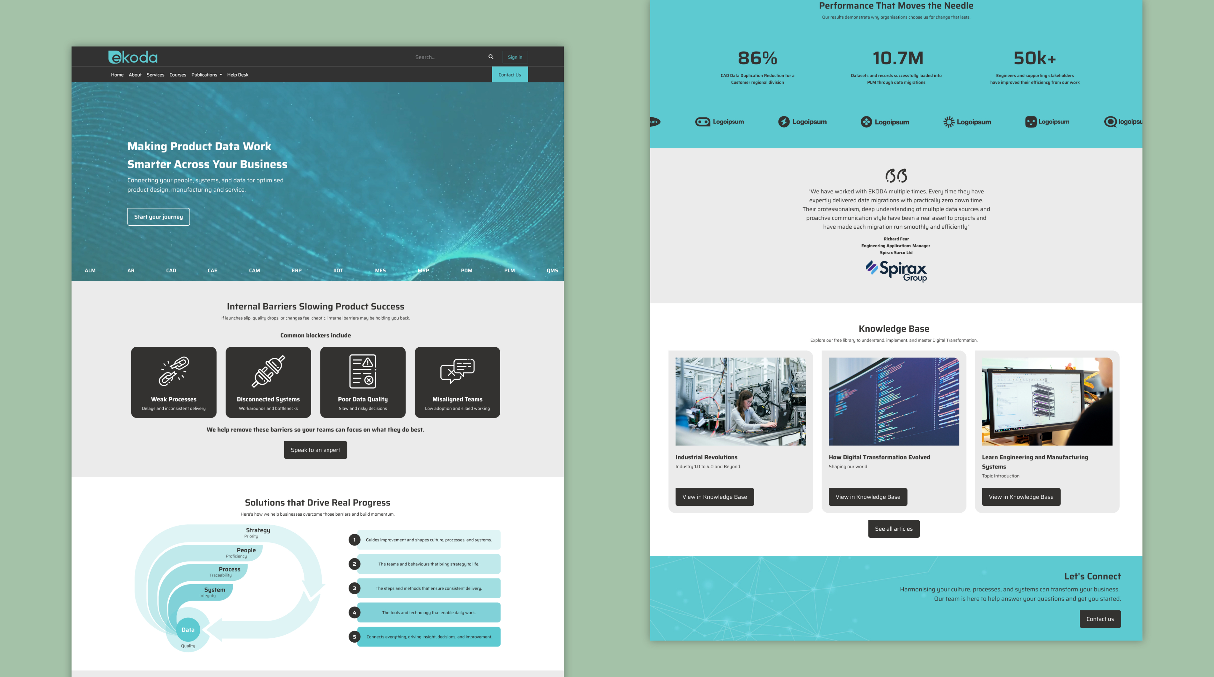
Rebranding a digital consultancy
Creating a cohesive identity and website to support growth
See all projects