
Transforming a technical business into a modern brand
Developing a modern brand system and website to help a specialist digital transformation consultancy stand out in a competitive market
Brand Idently
Web Design
UX Design
UI Design
Content Design
Visual Identity
Art Direction
Tone of Voice
Figma
Adobe Suite

Finding the real problem to solve
This consultancy operates in a highly technical space; supporting engineering and manufacturing teams through digital transformation, PLM/PDM services, and organisational change. While their expertise was strong, their brand lacked cohesion, clarity and the credibility expected in their market. The brief was to shape a complete visual identity and tone of voice that reflected their professionalism, while remaining accessible to non-technical audiences. This extended into a full redesign of their website, marketing materials and internal documentation, ensuring every touchpoint communicated trust, capability and modernity.
My role
Sole Designer
I acted as the sole designer across brand, digital, and marketing outputs. From refining the brand identity to redesigning the full website, I shaped a cohesive visual and verbal system that elevated the consultancy’s professionalism and positioned them more confidently within their competitive landscape.
How I contributed
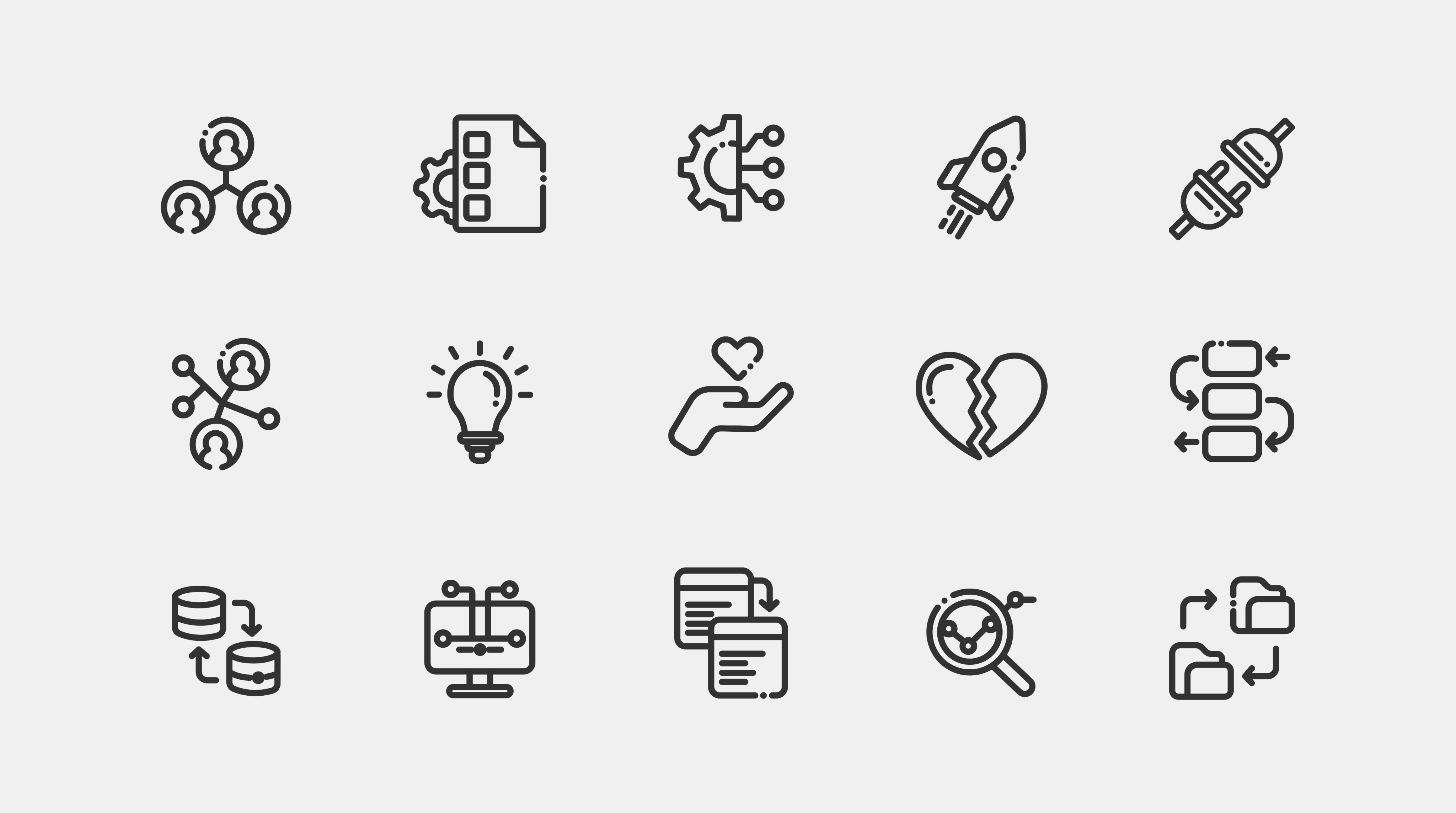
- Created a complete brand identity system, including logos, colour palette, typography, iconography, and illustration style.
- Developed brand guidelines, business cards, and templates.
- Designed a refreshed website informed by competitor analysis and modern UX standards.
- Sourced and edited images to create a more polished visual presence.
What I delivered
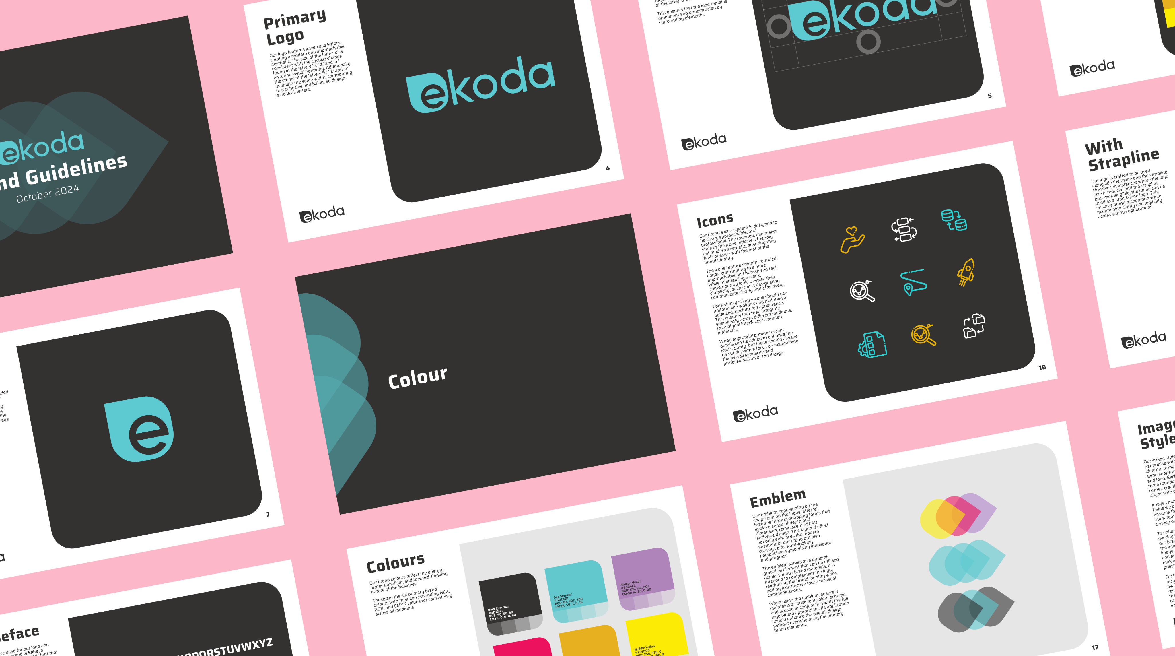
- A unified brand identity and comprehensive guidelines.
- A redesigned website with improved structure, clarity, and credibility.
- A suite of marketing and communication assets: business cards, templates, icons, brand marks, and illustrations.
- Updated content and help materials to ensure consistency across every customer and client touchpoint.

Building a brand that matches their expertise
The goal wasn’t just to refresh visuals, it was to give the company a brand and website that actually reflected the work they do. Their old identity felt flat and out of sync with their expertise. The new system brings everything together. Clearer messaging, a stronger visual presence, and a website that’s much easier for clients to understand.
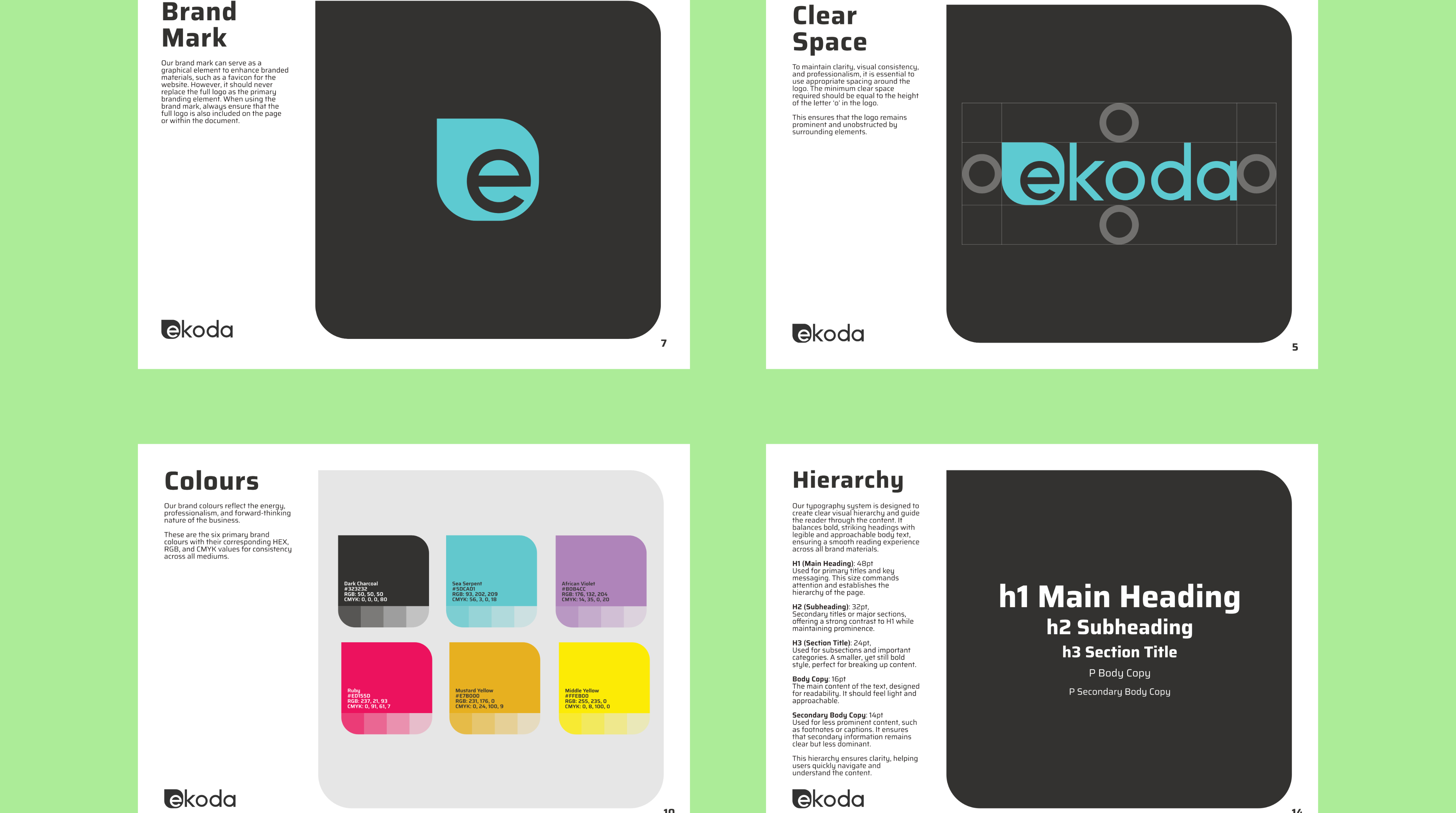
A clearer, more confident identity
The updated brand feels more established and trustworthy, giving them a stronger foothold in a technical, highly competitive market. The colours, typography and layout choices all help communicate clarity and credibility.
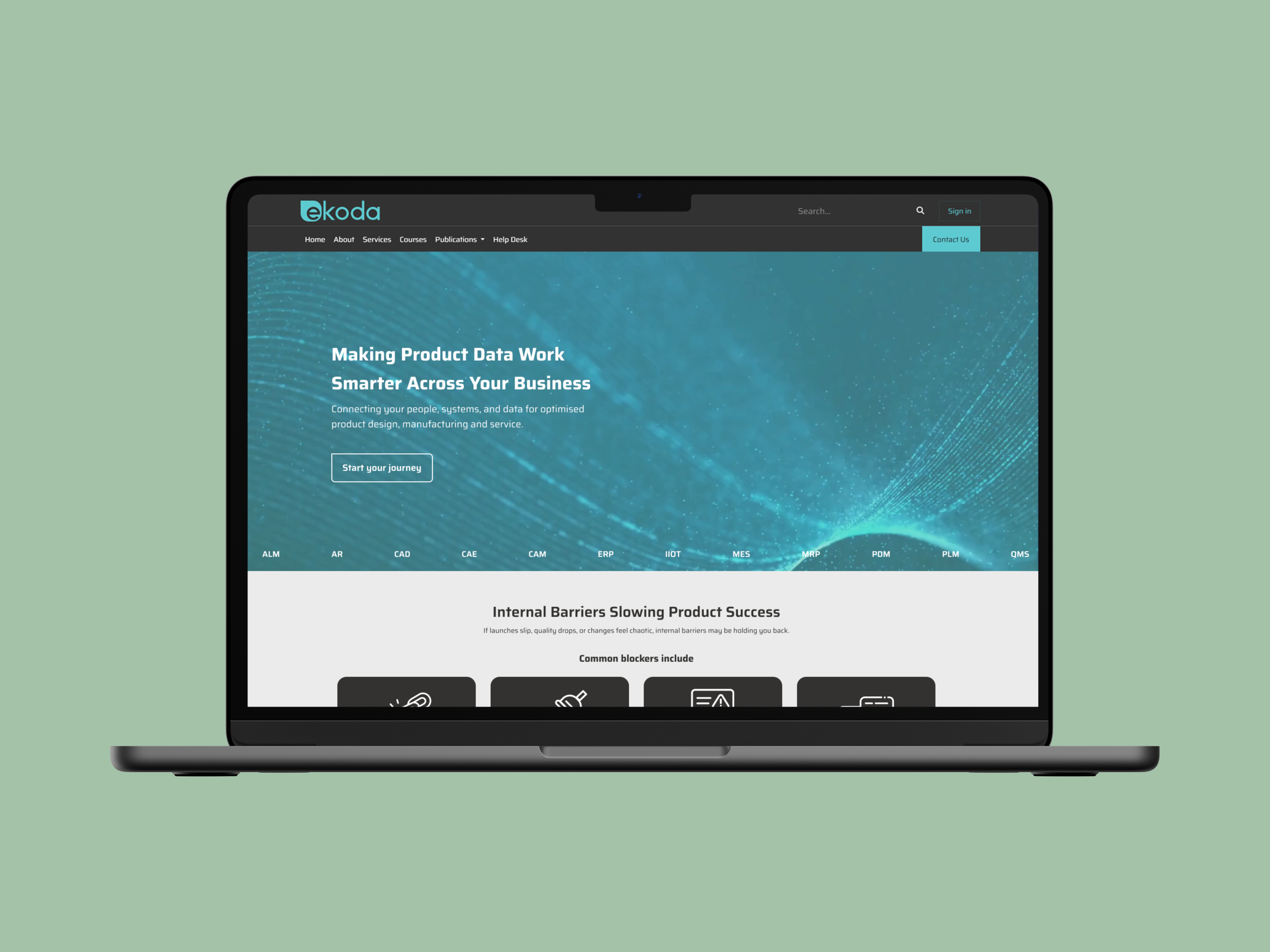
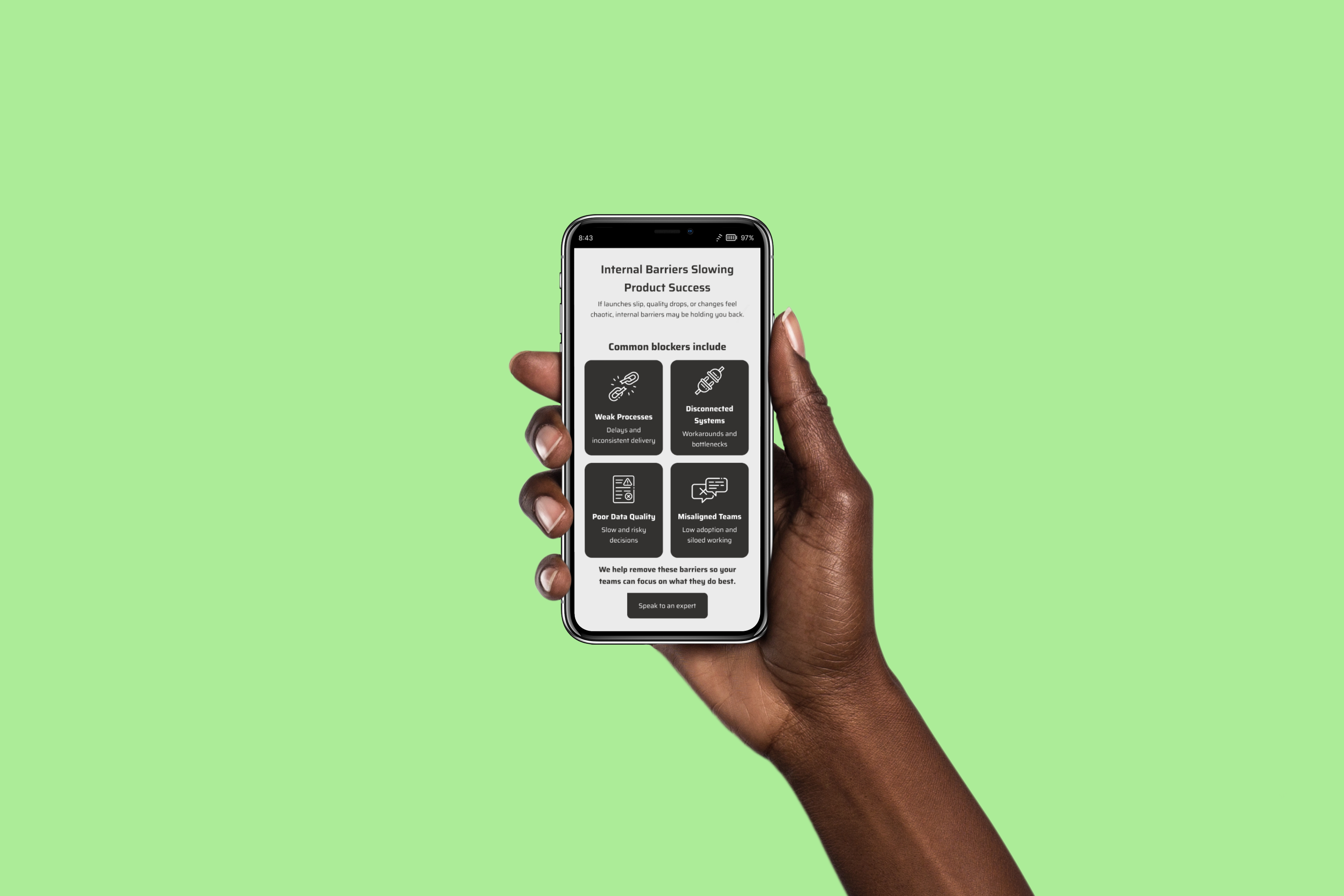
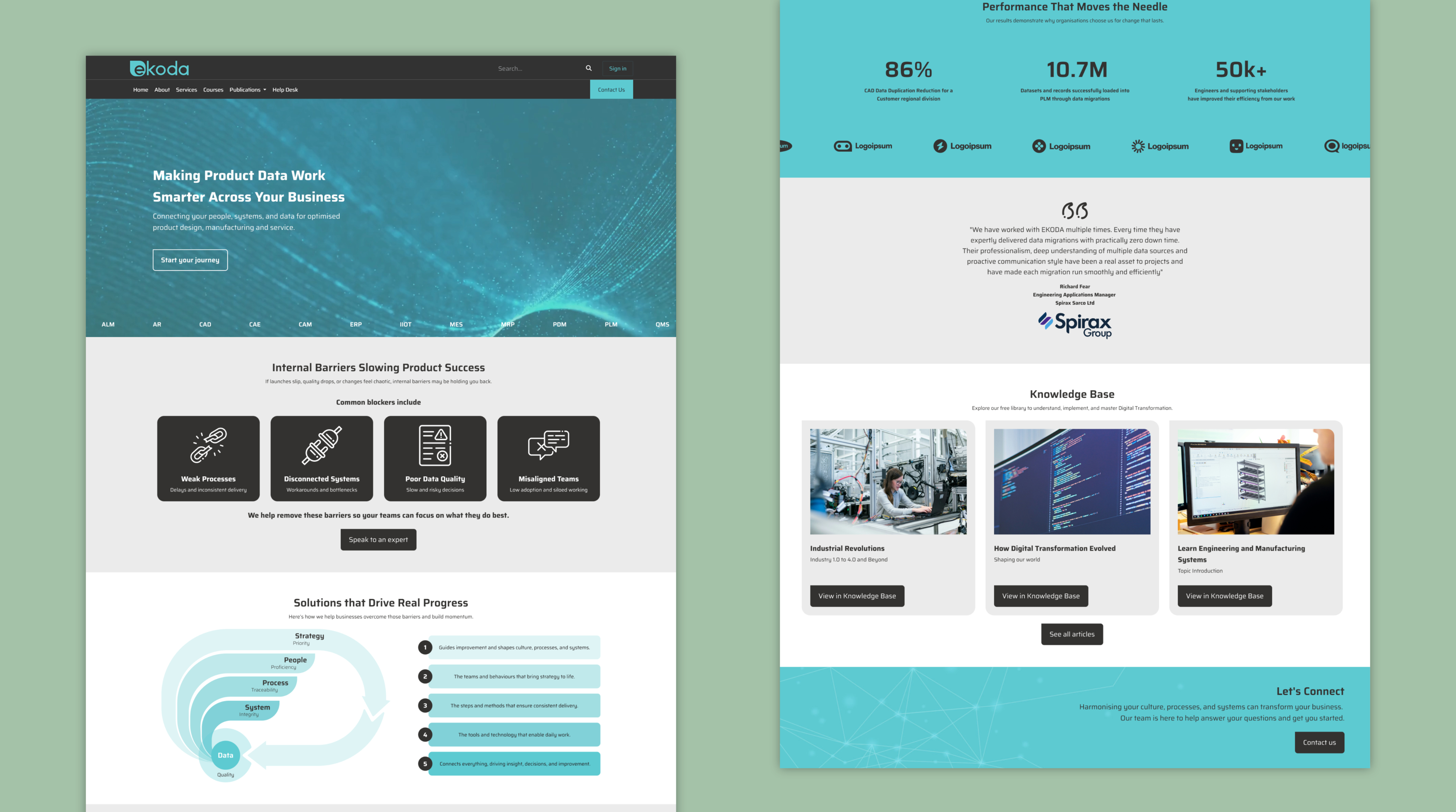
A website that explains what they do without the jargon
Their services can get complex, so the focus was on structure, simplicity and flow. The redesigned site helps potential clients understand their offering quickly, without losing the depth or detail they rely on.
Consistency across everything they share
Templates, illustrations, help articles, brand marks; everything now works together. It’s easier for the team to use, easier for clients to recognise, and gives the whole brand a sense of cohesion it didn’t have before.


A unified brand in practice
A showcase of the brand and website redesign in action.


More work worth exploring
From digital products to brand experiences, a curated selection of my work.
UX/UI
Accessibility
Prototyping
Designing for smarter hiring decisions
Making complex talent insights simple and human.
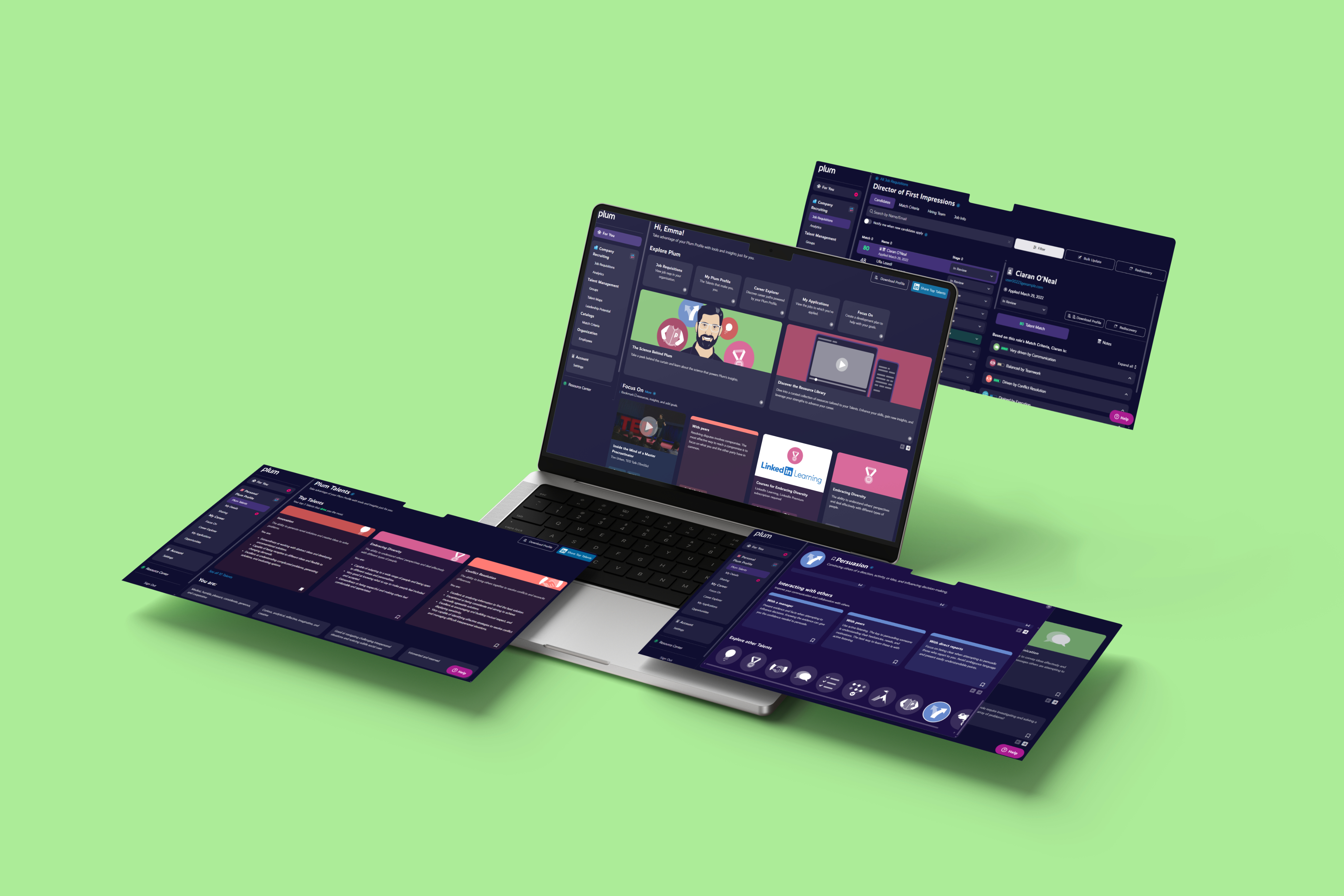

UX/UI
User Research
Prototyping
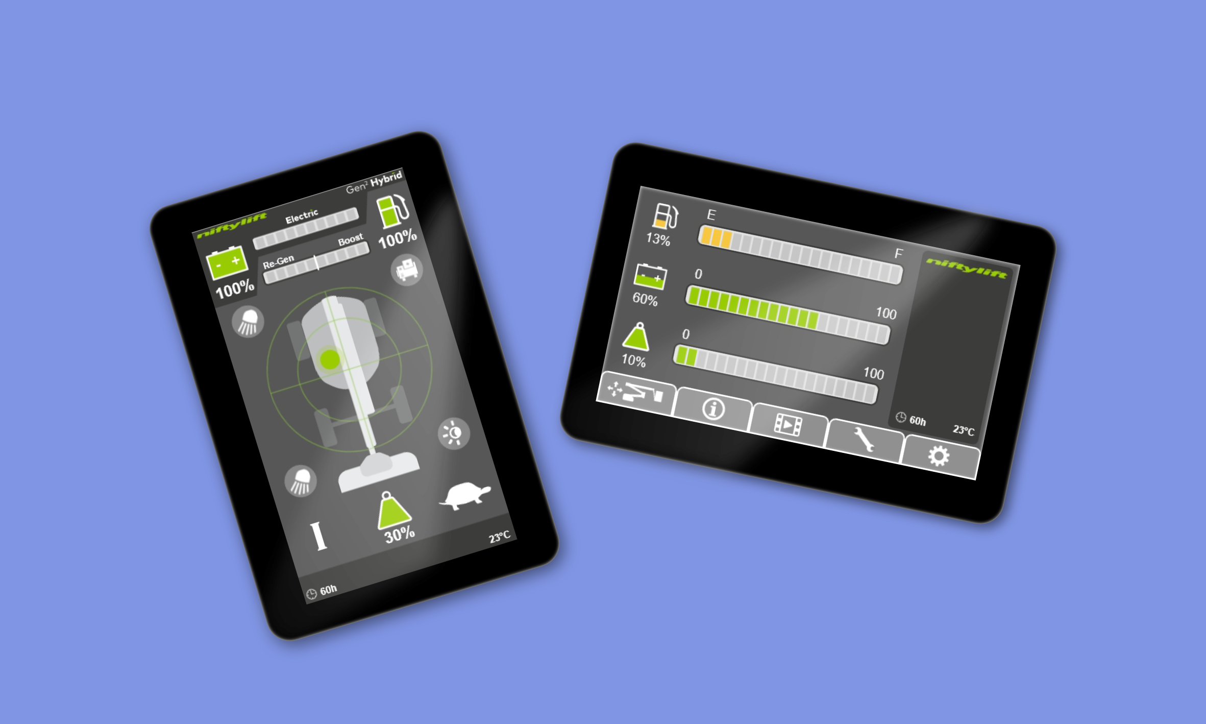
Redefining the operator experience
Designing intuitive machine interfaces to improve safety and efficiency.
UX/UI
Branding
Web Design
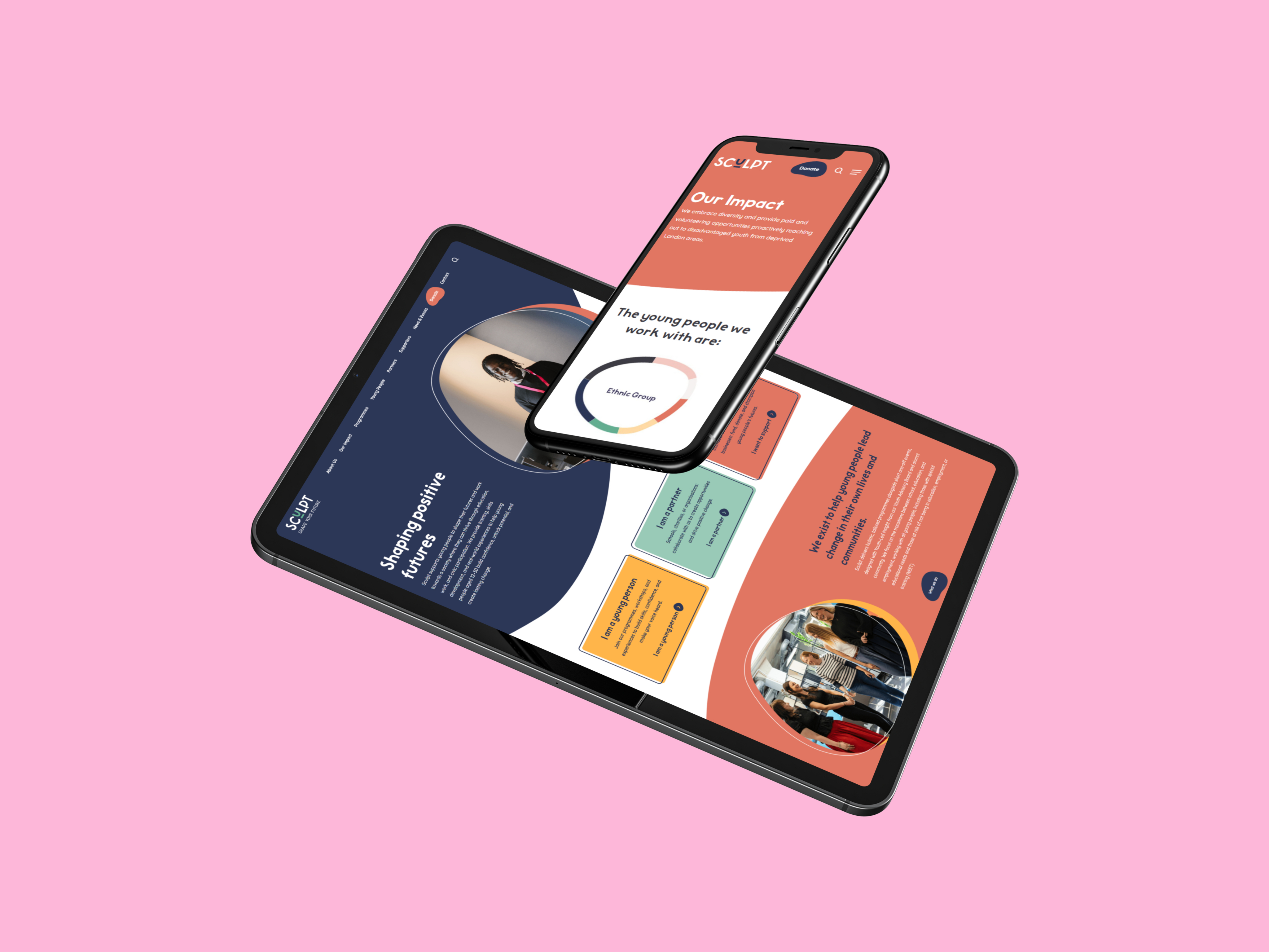
Helping a youth charity show up with confidence
Brand and digital redesign focused on clarity and trust.
See all projects


Transforming a technical business into a modern brand
Developing a modern brand system and website to help a specialist digital transformation consultancy stand out in a competitive market
Brand Identlyy
Web Design
UX Design
UI Design
Content Design
Visual Identity
Art Direction
Tone of Voice
Figma
Adobe Suite
Finding the real problem to solve
This consultancy operates in a highly technical space; supporting engineering and manufacturing teams through digital transformation, PLM/PDM services, and organisational change. While their expertise was strong, their brand lacked cohesion, clarity and the credibility expected in their market. The brief was to shape a complete visual identity and tone of voice that reflected their professionalism, while remaining accessible to non-technical audiences. This extended into a full redesign of their website, marketing materials and internal documentation, ensuring every touchpoint communicated trust, capability and modernity.
My role
Sole Designer
I acted as the sole designer across brand, digital, and marketing outputs. From refining the brand identity to redesigning the full website, I shaped a cohesive visual and verbal system that elevated the consultancy’s professionalism and positioned them more confidently within their competitive landscape.
How I contributed
- Created a complete brand identity system, including logos, colour palette, typography, iconography, and illustration style.
- Developed brand guidelines, business cards, and templates.
- Designed a refreshed website informed by competitor analysis and modern UX standards.
- Sourced and edited images to create a more polished visual presence.
What I delivered
- A unified brand identity and comprehensive guidelines.
- A redesigned website with improved structure, clarity, and credibility.
- A suite of marketing and communication assets: business cards, templates, icons, brand marks, and illustrations.
- Updated content and help materials to ensure consistency across every customer and client touchpoint.
Building a brand that matches their expertise
The goal wasn’t just to refresh visuals, it was to give the company a brand and website that actually reflected the work they do. Their old identity felt flat and out of sync with their expertise. The new system brings everything together. Clearer messaging, a stronger visual presence, and a website that’s much easier for clients to understand.
A clearer, more confident identity
The redesigned interface distilled complex machine states into simple, readable visuals, helping operators understand status and risks at a glance.
A website that explains what they do without the jargon
Their services can get complex, so the focus was on structure, simplicity and flow. The redesigned site helps potential clients understand their offering quickly, without losing the depth or detail they rely on.
Consistency across everything they share
Templates, illustrations, help articles, brand marks; everything now works together. It’s easier for the team to use, easier for clients to recognise, and gives the whole brand a sense of cohesion it didn’t have before.
A unified brand in practice
A showcase of the brand and website redesign in action.
More work worth exploring
From digital products to brand experiences, a curated selection of my work.
UX/UI
Accessibility
Prototyping
Designing for smarter hiring decisions
Making complex talent insights simple and human.
UX/UI
User Research
Prototyping
Redefining the operator experience
Designing intuitive machine interfaces to improve safety and efficiency.
UX/UI
Branding
Web Design
Helping a youth charity show up with confidence
Brand and digital redesign focused on clarity and trust.
See all projects
Transforming a technical business into a modern brand
Developing a modern brand system and website to help a specialist digital transformation consultancy stand out in a competitive market
Brand Identity
Web Design
UX Design
UI Design
Content Design
Visual Identity
Art Direction
Tone of Voice
Figma
Adobe Suite
Finding the real problem to solve
This consultancy operates in a highly technical space; supporting engineering and manufacturing teams through digital transformation, PLM/PDM services, and organisational change. While their expertise was strong, their brand lacked cohesion, clarity and the credibility expected in their market. The brief was to shape a complete visual identity and tone of voice that reflected their professionalism, while remaining accessible to non-technical audiences. This extended into a full redesign of their website, marketing materials and internal documentation, ensuring every touchpoint communicated trust, capability and modernity.
My role
Sole Designer
I acted as the sole designer across brand, digital, and marketing outputs. From refining the brand identity to redesigning the full website, I shaped a cohesive visual and verbal system that elevated the consultancy’s professionalism and positioned them more confidently within their competitive landscape.
How I contributed
- Created a complete brand identity system, including logos, colour palette, typography, iconography, and illustration style.
- Developed brand guidelines, business cards, and templates.
- Designed a refreshed website informed by competitor analysis and modern UX standards.
- Sourced and edited images to create a more polished visual presence.
What I delivered
- A unified brand identity and comprehensive guidelines.
- A redesigned website with improved structure, clarity, and credibility.
- A suite of marketing and communication assets: business cards, templates, icons, brand marks, and illustrations.
- Updated content and help materials to ensure consistency across every customer and client touchpoint.
Building a brand that matches their expertise
The goal wasn’t just to refresh visuals, it was to give the company a brand and website that actually reflected the work they do. Their old identity felt flat and out of sync with their expertise. The new system brings everything together. Clearer messaging, a stronger visual presence, and a website that’s much easier for clients to understand.
A clearer, more confident identity
The updated brand feels more established and trustworthy, giving them a stronger foothold in a technical, highly competitive market. The colours, typography and layout choices all help communicate clarity and credibility.
A website that explains what they do without the jargon
Their services can get complex, so the focus was on structure, simplicity and flow. The redesigned site helps potential clients understand their offering quickly, without losing the depth or detail they rely on.
Consistency across everything they share
Templates, illustrations, help articles, brand marks; everything now works together. It’s easier for the team to use, easier for clients to recognise, and gives the whole brand a sense of cohesion it didn’t have before.
A unified brand in practice
How the logo, colours, typography, and illustrations shaped a cohesive, modern brand.
More work worth exploring
From digital products to brand experiences, a curated selection of my work.
UX/UI
Accessibility
Prototyping
Designing for smarter hiring decisions
Making complex talent insights simple and human.
UX/UI
Branding
Web Design
Helping a youth charity show up with confidence
Brand and digital redesign focused on clarity and trust.
UX/UI
User Research
Prototyping
Redefining the operator experience
Brand and digital redesign focused on clarity and trust.
See all projects